Last updated on September 5th, 2025 at 01:41 pm
Sherwin-Williams’ Intellectual Gray (SW 7045) is somehow a warm, earthy neutral for your space needs. Cuz its a blend of gray, beige, and slightly green undertones,Offers you cold when its needed,it changes with the depth and range of light in your room.
Doesnt matter if you’re redesigning a cozy bedroom, modern kitchen, or even your home’s exterior, this paint is perfect for your imagination into reality, Personally, i love it after Benjamin Ashen Tan 996 ,ummm cuz its bit warmer than this this.
In this post, I’ll share TONS OF REAL HOME IMAGES plus tell you about the undertones of Intellectual Gray, how it behaves in different lighting, and how to pair it with complementary colors for a cohesive, stylish look.


What are the undertones of Intellectual Gray (SW 7045)?
Intellectual Gray is best described as a warm neutral gray with subtle green undertones. In daylight, it reads as a gentle gray-beige (greige) tone, but its faint green/taupe hues emerge under certain lighting. In practice, this means IG rarely looks icy or purely cool; instead it carries an earthy warmth.
(Some designers also note very faint pink or mint tones in the undertone mix, but these are usually imperceptible unless viewed next to strong contrasting colors.) In bright natural light, the greenish cast becomes a touch more evident – giving a fresh, organic feel – whereas in dim or incandescent light the gray deepens and feels cozier.
In short, IG sits between gray and beige: a warm gray-green that adapts (it “shifts beautifully with the light”), never appearing stark or blue.
Similar color option: Review-Ashley Gray (HC-87) by Benjamin Moore-Why to Choose
LRV of Intellectual Gray (SW 7045)

Intellectual Gray has an LRV around 35–36. (LRV is the percentage of light a color reflects on a scale of 0=black to 100=white.) An LRV in the mid-30s means IG is a medium-depth tone.
It is much lower than very light neutrals – for comparison, Agreeable Gray (SW 7029) has an LRV around 60 – so IG will appear notably deeper and richer. In a well-lit room it can still look moderate (not as dark as charcoal), but in low light it can feel substantially moody.
Intelectual Gray “reflects a moderate amount of light” and will look lighter and more dynamic in bright sun, whereas in shadow it creates a more intimate, cocooned atmosphere.
In summary: at LRV ~36, Intellectual Gray is a true mid-tone neutral – lighter than dark grays, but deeper than most off-whites – with enough “body” to ground a space.
Appearance in Different Lighting

Like many nuanced grays, IG’s color can vary considerably with light. In natural daylight, its warm beige/green warmth is most true: north-facing (cool) light makes it look subdued and somewhat cooler, while sun-drenched south- or west light warms it up.
For example, in a north-facing room IG “may look more subdued and cooler” (soft gray) under limited light, whereas in a bright south-facing space it appears lighter and with its warmer undertones brought forward.
Under artificial light, the effect depends on the bulb: warm incandescent/halogen lighting will “highlight [IG’s] beige undertones and make the space feel cozier,” while cool LEDs or fluorescents tend to mute the warmth and make it look a touch grayer.
In reality, under warm evening light IG will read warmer/cozier; under cool white light it will look a bit more neutral. In all cases, designers emphasize IG’s chameleon-like quality – it “shifts beautifully with the light throughout the day” – so test samples in your own lighting to see the full range.
GET YOUR SAMPLE HERE
Usage in Different Spaces
Bedroom

In sleeping areas, Intellectual Gray creates a softness, restful backdrop. Its warm gray tone is calming and not too stark, make it good option for bedrooms. Designers suggest pairing Intellectual Gray (SW 7045) walls with crisp white linens and soft accent colors (like pale pinks, sage green or muted blues) for a cozy yet fresh look. In my opinion, if you dont want to plae the look then dont add earthy colors.
Because it has depth without being overwhelmingly dark, IG will make bedroom walls feel intimate rather than sterile. It works well with natural wood and soft textures (plush rugs or drapery), and can take on warmer cozier vibes under lamp light.
Living Room

As a main wall color in living/family rooms, Intellectual Gray provides a soothing, versatile neutral. It’s deep enough to frame furniture but still neutral enough to pair with many styles. But i dont recommend using it on all walls in your living room.
For example, Some people have used Intellectual Gray works with natural wood floors, leather or linen upholstery, and metallic accents – yielding a balanced, upscale look. In open-plan living areas with plenty of light, Intellectual Gray will maintain warmth (less likely to look flat or cold), whereas in darker spaces it will lend coziness.
But if you ll ask me ,i will say go with some cherrywood floors or some tiles or marble ,cuz it has some i mean warm undertones,if you will add some bright of cool floor options the feel of rest will be balanced and relaxed.
One design blog notes Intellectual Gray (SW 7045) “opens up a world of options for wall color partners” when used on cabinets or walls; similarly, on living room walls it pairs nicely with warm off-whites (trim) or deeper charcoals for contrast.
Kitchen & Cabinets

Intellectual Gray is increasingly popular for kitchens and cabinetry. On walls, it provides a warm, neutral backdrop that complements white cabinetry and stone countertops. On cabinets themselves, it creates a modern yet timeless look.
Designers recommend pairing IG cabinets or walls with bright white counters/backsplashes and accent hardware in brass or black for contrast. It also holds up well in bright kitchen lighting; as one consultant notes, IG “opens up a world of options” for coordinating walls when used on cabinets, and on exteriors (or bright areas) it “won’t wash out as much as lighter shades”.

In practical terms, IG on kitchen cabinets reads as a warm greige and hides smudges (darker than pure white cabinets), while still keeping the space feeling light.
Bathroom
Although less frequently cited, IG can work well in bathrooms – especially larger or well-lit ones. Its warm gray character adds softness to ceramic tile or stone, and it pairs nicely with white fixtures and chrome/brushed-metal hardware.
In a bathroom with natural light, IG’s green-beige warmth can look luxurious and spa-like. (Design professionals often pair it with crisp or creamy whites for trim in other rooms, which would similarly brighten a bathroom.)
In dimmer bathrooms, IG will simply feel more slate-gray and grounding. As always, be mindful of light: IG in a north-facing half-bath may read cooler, while in an east-facing bathroom with morning light it will feel warmer.
Exterior

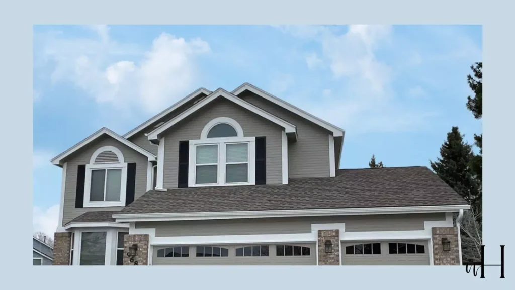
Intellectual Gray is used on house exteriors, especially on homes with plenty of sunlight or greenery. Because of its medium LRV, it holds up under sun better than very light pastels (which might wash out).
It shows subtle warmth next to landscaping. One designer notes that IG “is great on an exterior with a ton of natural light” – it won’t appear faded, and its green-beige undertones can complement brick or stone. In warm climates or sunlit facades, IG will look like a warm gray-beige (not blue-gray). Trimmed out with white or black, it creates a sophisticated modern look.
(Pairing exteriors: IG looks harmonious with warm whites like Shoji White or pure crisp whites for trim. It also marries well with natural wood or stone elements.)

Coordinating Colors of Intellectual Gray (SW 7045)
Intellectual Gray is highly versatile in palettes. Here are some recommended schemes:
Soft (Light/Neutral) Palettes

Pair Intellectual Gray with creamy whites and gentle neutrals to keep the scheme airy. Examples include Sherwin-Williams Alabaster (SW 7008) or Shoji White for trim and ceilings, or light greige hues like Worldly Gray (SW 7043) on adjacent walls.
Pale pastels can be soft accents; for instance, blush pink or mint accents echo its subtle undertones. A soft palette might use one or two darker neutrals (e.g. SW Dovetail 7018) for contrast in fabrics, or very light grays for continuity.
Bold Palettes
Intellectual Gray can anchor dramatic accents. Deep navy or charcoal contrast beautifully; for example, Sherwin-Williams Naval (SW 6244) or Benjamin Moore Hale Navy as an accent wall or cabinetry makes a striking statement against Intellectual Gray (SW 7045).
Warm accent colors also work – such as SW Coral Clay (SW 9005) or a terracotta – which pick up IG’s warmth. Even black (SW 6258 Tricorn Black) or a saturated jade/emerald can energize a room. (For instance, a bold black island or door pops against IG walls.) These high-contrast schemes play off IG’s neutrality: IG maintains balance while the accent pops.
Muted/Earthy Palettes

For a subdued palette, use warm earth tones alongside IG. Tones like Accessible Beige (SW 7036) or Balanced Beige provide a warm backdrop that resonates with Intellectual Gray (SW 7045)tone.
Muted greens and golds complement its undertones; for example, a sage/olive-green (SW 6207 Retreat) or a soft ochre/gold (SW 6402 Antiquity) echo IG’s subtle warmth. These colors create a cozy, unified scheme. Greige-taupe colors (like Fawn Brindle, SW 7640) can be used on woodwork or furnishings for a tonal look.
The key is keeping saturation low and warmth consistent; IG’s green-beige base means other colors with warm-yellow or greenish undertones will blend smoothly.
In summary, Intellectual Gray “pairs effortlessly” with a wide range of hues. White/off-white trim (Shoji White, Alabaster) always looks crisp. For punches of color, designers recommend either deep jewel tones or warm earth tones as above.
In practice, many decorators use Intellectual Gray (SW 7045) as a neutral “canvas” and layer in either cozy warm neutrals or a single bold accent. (The Sherwin-Williams site itself even suggests pairing IG with creamy whites like Shoji White.)
Comparisons
Intellectual Gray vs. Agreeable Gray (SW 7029)
These are both warm neutral grays, but Agreeable Gray (AG) is much lighter. AG’s LRV is about 60, versus IG’s ~36, so AG will appear almost twice as light. In terms of tone, AG is a classic greige: it has “beige undertones” and is designed to be extremely versatile.
It often looks like a soft warm gray or greige that can even flash a touch of lavender or green in different lights. In contrast, IG is a deeper gray-green; it is definitively darker and richer. Both have warm bases, but AG leans slightly more toward beige (it is often described as the perfect warm gray), whereas IG leans a bit more green-taupe.
In rooms, this means AG will make a space feel brighter and more open (good for low-light or whole-house use), while IG makes a room feel more cozy and substantial. (For example, designers note AG “reflects more light than it absorbs”, whereas IG absorbs more light.) Use AG when you want a warm neutral that reads light and flexible; use IG when you want a warm neutral with more depth and subtle character.
Intellectual Gray vs. Fawn Brindle (SW 7640)
Both are mid-tone warm grays, but Fawn Brindle is notably warmer in appearance. Fawn Brindle’s LRV is about 36 (very close to IG’s). However, Fawn Brindle has stronger beige-brown influences: it’s essentially a greige that “commits more to warmth”.
In practice, Fawn Brindle will look slightly more tan/greige (with a subtle green-gray cast), while IG remains more a pure warm gray-green. In descriptions: “Fawn Brindle is warmer than the others, with a bit more beige-brown in its backdrop and that beautiful subtle green undertone”. By comparison, IG has less beige and more neutral gray.
On an exterior or well-lit wall, Fawn Brindle will appear richer/creamier, whereas IG will read as a neutral gray. Both pair well with earthy accents, but if you want the room to skew “sand-beige”, Fawn Brindle leans that way; if you want a balanced gray with a greenish hint, IG is the choice.
In summary: Agreeable Gray vs. Intellectual Gray AG is lighter (LRV60) and more beige; IG is darker (LRV36) and greener. Fawn Brindle vs. Intellectual Gray: Both are medium warm grays (LRV~36), but Fawn Brindle is creamier/warm beige, while IG is cooler/greener. These distinctions affect where and how each is used.

