Last updated on August 16th, 2025 at 12:02 pm
If you ask me about the perfect gray, you know my answer will be Krypton of Sherwin-Williams. That can actually make your home cozy and cool and also warm at the same time.
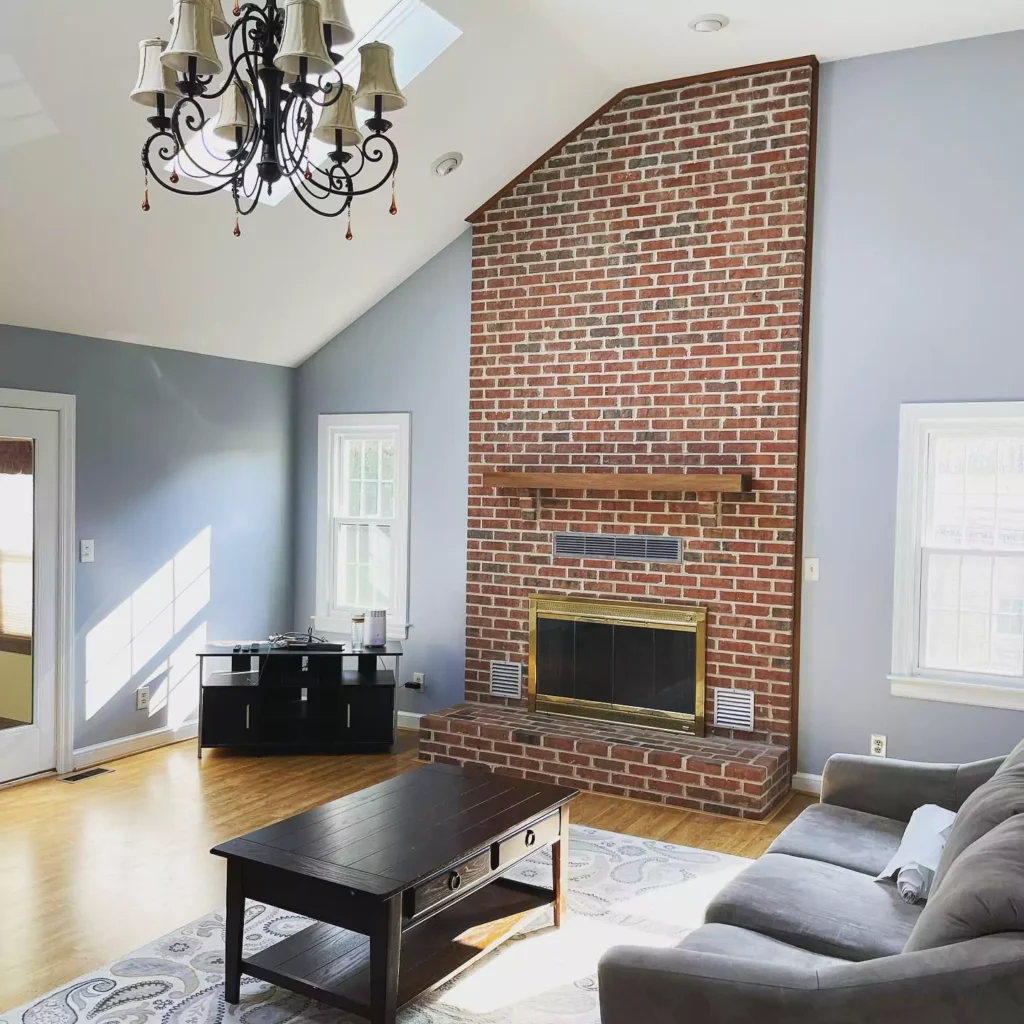
If you are thinking of painting your living room for winter, then I would recommend using it as an accent wall,as in low light it will get cool, its gray color undertone will come out.
Keep reading ive also added TONS OF REAL HOMES IMAGES.In this post i will tell about Krypton Color that we all love for fresh and gray blue vibe.
Ive also oainted it once in my livingroom that i will attach the images of before and after ,also ive seen this color in my friends and family members homes in diffrent areas ,i will share the feel ,i mean first time when i saw this color in diffrent spaces like bedroom ,livingroom and kitchen and what i felt?
To read out the best blue-gray paint color, read my blog. 18 Blue-Gray Paint Colors by Sherwin-Williams & Benjamin Moore
What are the undertones of Krypton?
Sherwin-Williams Krypton SW 6247 is a cool, mid-tone blue-gray. It reads as a blue with a strong gray undertone that the makes the sharpness of blue soft.
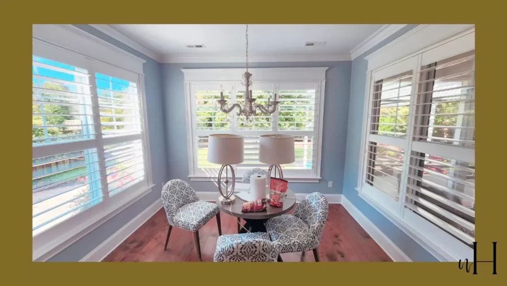
In homes, as I’ve observed in different homes its pale powder blue paint color in bright light ,but if you think about dark light it will convert into gray color, which will cool down your area.
What is the LRV of Krypton SW 6247?
As you know, the LRV scale is 100, which means when the LRV is above 50, it means the color is bright; if it’s less than 50 color is going to be dark in shades.
Light Reflectance Value (LRV) of Krypton is about 52, meaning it reflects roughly half the light of white, not too dark but richer than a pastel. This moderate LRV makes Krypton versatile, showing up as lighter in bright rooms and deeper in low light.
Krypton’s undertones are primarily gray. Design blogs note that it can carry subtle hints of other tones (some describe faint green, purple or even yellow hints), but the dominant effect is a calm blue-grey.
In essence, Krypton is a cool-toned blue rather than a true gray. It’s often described simply as a “sophisticated blue” with a muted, neutralizing base.
Lighting Effect on Krypton
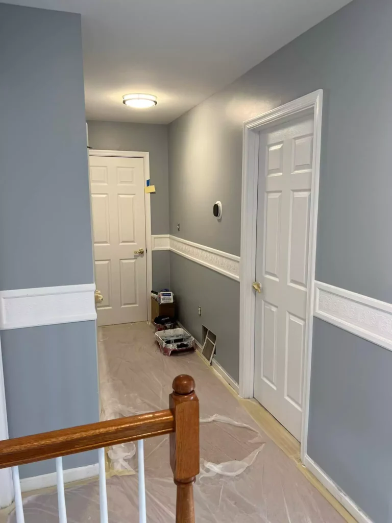
Like any paint, Krypton reacts to light. In north-facing or shadowed rooms, it will pull more gray (appearing muted), whereas warm southern or western light makes it look a bit warmer and bluer.
In early morning (east light) it may appear slightly toned-down, then brighten as daylight shifts. Overall, ensure good natural or warm artificial light to keep it from being too cold.
Krypton in Different Rooms
Krypton’s chameleon-like quality means it can look slightly different depending on light. For example, under cool north light its gray base comes forward, while strong south or west light will accentuate its blue tone.
In small or poorly lit rooms it might seem more gray or subdued. Conversely, in bright light it reads as a crisp muted blue. Testing Krypton on large swatches is advised to see its subtle shifts.
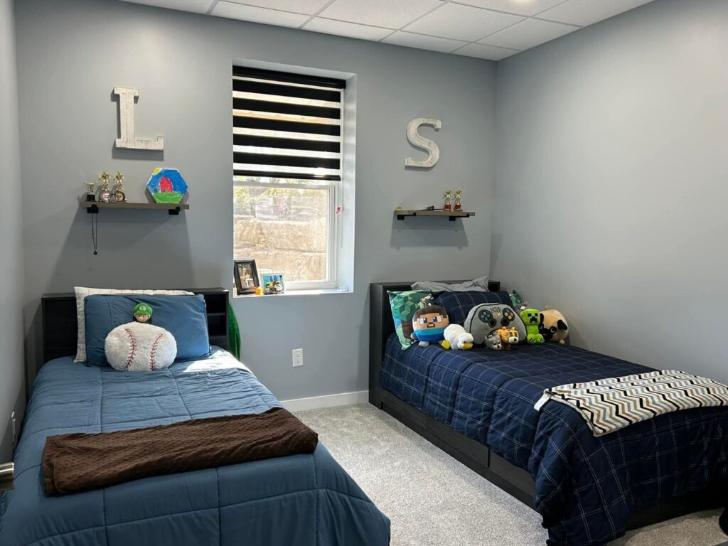
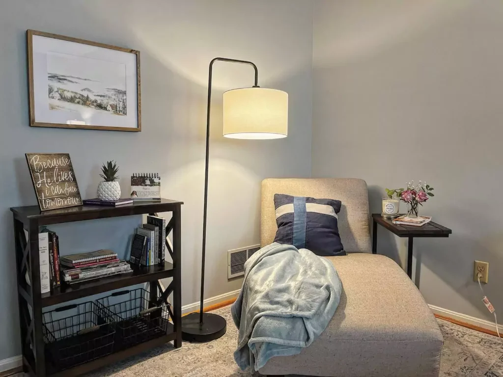
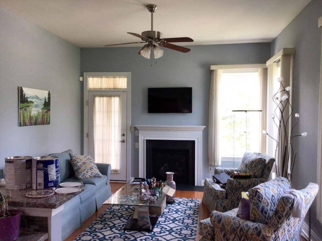
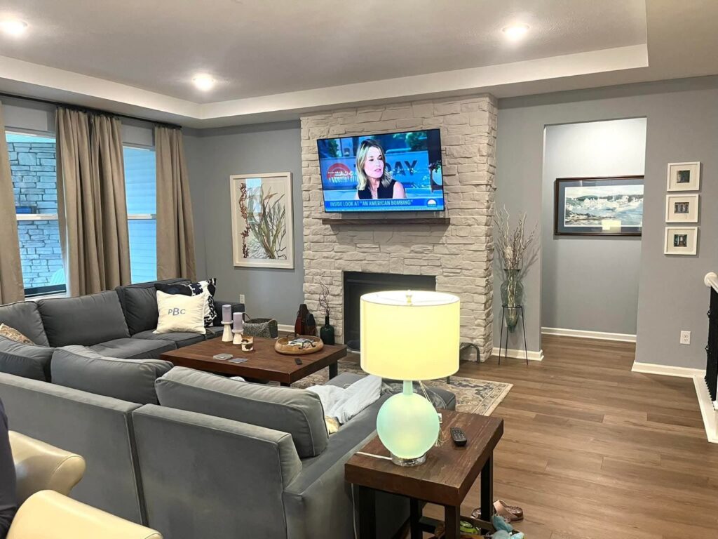
Bedrooms & Living Areas
Krypton creates a calm, tranquil vibe ideal for bedrooms or living rooms. Its soft blue-gray undertones can make spaces feel restful and spacious.With neutral bedding and warm wood furniture krypton can go beautifully for your bedroom without making your room and living area dark.
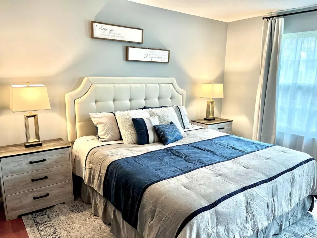
Design guides note its “cool, soothing” effect opens up small rooms and promotes relaxation. Pair it with light woods and soft textiles for an airy, spa-like scheme, or with darker furnishings for modern contrast.
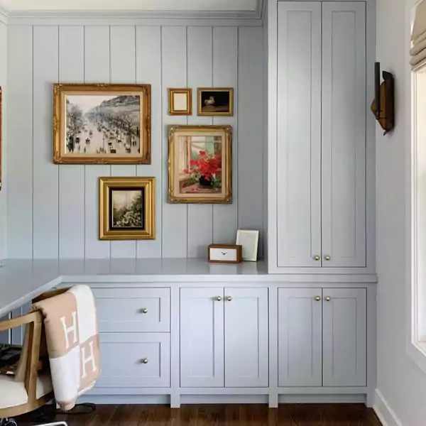
Kitchens & Cabinets
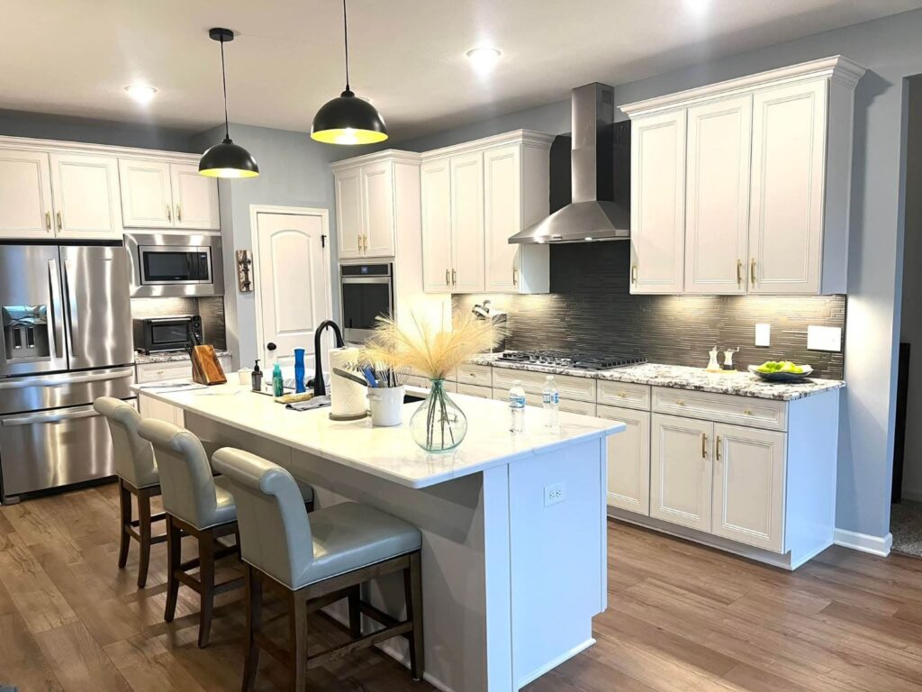
Krypton is popular on kitchen cabinets and trim. I will recommend you to apply to lower cabinets or an accent wall, umm maybe on backsplash, it adds understated elegance.
According to Sherwin-Williams guides, “Krypton works beautifully on cabinetry, especially when paired with white or light gray countertops”.
Its good choice if you want something contemporary and fresh in your kitchen.
For a modern touch, use a semi-gloss finish for durability and sheen. Krypton also suits built-in shelves or a kitchen island for a pop of color that remains subtle.
Bathrooms and Spa-Like Spaces
In bathrooms, Krypton lends a crisp, clean feel. Its cool tone evokes a spa-like atmosphere, especially when combined with white subway tile, marble counters or chrome fixtures. Use it on walls or vanities to keep the space airy.
Because Krypton has enough depth to contrast with white, it won’t appear stark.
Exterior Use
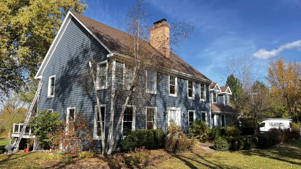
Krypton’s muted blue-gray works well outdoors on siding, doors or shutters. It gives a “timeless appeal” that pairs nicely with crisp white trim or stone accents. For example, a front door in Krypton against white trim creates a classic look.
Its moderate LRV means it won’t fade as dramatically as very dark colors under sun exposure. Many homeowners find it a modern alternative to navy or gray for a clean exterior facade.
Coordinating Colors & Palettes
Krypton’s neutral base makes it easy to style in different palettes. Try these groupings for varied looks:
Soft/Neutral Palette
I my experience, pair with pale neutrals for an airy feel. Extra White (SW 7006) or Agreeable Gray (SW 7029) trim and accents keep the scheme light and soft.
These crisp off-whites and greiges let Krypton gently stand out without high contrast. In decor, use light woods, cream textiles or muted pastels to enhance the soothing vibe.
Bold Accents
For drama, combine Krypton with deep blues or grays. Darker accents like Granite Peak (SW 6250) or Naval (SW 6244) amplify the blue tone and add richness.
For instance, navy throw pillows, charcoal furniture or a feature wall in a darker hue create striking contrast. A bold color on one wall or accessories will make Krypton feel more vibrant and layered.
Muted/Earthy Palette
To mute the scheme, bring in nature-inspired hues. Soft green-grays and beiges complement Krypton’s gray undertone. Examples include Sea Salt (SW 6204) – a light greenish-gray – or Accessible Beige (SW 7036) – a warm beige.
These earthy tints soften the coolness of Krypton. Use them on adjacent walls, floors or fabrics to achieve an organic, relaxed palette.
In addition, popular pairing ideas include mixing Krypton with simple whites (Pure White) or metallics (nickel, brass) for modern touches. As one blogger notes, Krypton “pairs beautifully with natural materials” and can be dressed up with metals like nickel or black fixtures.
Its versatility means you can go minimal or eclectic: neutral linens and soft accessories for a gentle scheme, or vivid pillows and art for a lively contrast.
Frequently Asked Questions
Is Sherwin-Williams Krypton (SW 6247) blue or gray?
Krypton is essentially a cool blue-gray. It’s marketed as a blue paint, but its strong gray undertones give it a subdued, almost silvery appearance. In bright light it looks like a pale powder blue; in dimmer light it reads closer to a soft gray.
What Benjamin Moore color is closest to Krypton?
There’s no exact Benjamin Moore (BM) match for Krypton. Some similar BM shades are Smoke (2122‑40) or Gray Owl (OC‑52), but both are lighter and warmer. For example, BM Gray Owl has a higher LRV (~64 vs 52) and a warmer (greige) cast. BM Smoke (2122‑40) is closer in coolness but is also lighter (LRV ~56). In summary, Krypton is cooler and slightly darker than these BM options.
What is the difference between Misty (SW 6232) and Krypton (SW 6247)?
Misty is a lighter, softer blue with a hint of green, whereas Krypton is a cooler, deeper blue-gray. Krypton is darker and bluer on the other hand Misty has lrv of 64 which is more towards the green and mute undertone.
In practice, Misty will appear more muted and airy, and Krypton will show more pronounced blue tone and depth.
How does Krypton compare to Sherwin-Williams Upward (SW 6239)?
Upward is a lighter, brighter blue than Krypton. Upward’s LRV is about 57 (vs Krypton’s ~52), so it reflects more light. What ive observed for both colors is Upward is fresh and reflects more light compared to the krypton.
Both are cool blues, but Upward is a fresher sky-blue, whereas Krypton is a medium slate-blue.
North Star (SW 6246) vs. Krypton
North Star is very close to Krypton in hue, but North Star is lighter and slightly cleaner. North Star’s LRV is about 64 compared to 52 for Krypton. This means North Star will look brighter on the wall. In practice, North Star has “a little less gray” and reads a touch more pastel blue, while Krypton is grayer and duskier.
Krypton vs. Stardew (SW 9138)
Stardew is a darker, greener blue-gray. Krypton has higher reflectance (~52 vs ~43), so Krypton appears lighter. Both have cool tones, but Stardew often looks more muted and veers slightly toward green. Krypton will show a clearer blue quality.
Krypton vs. Jubilee (SW 6248)
Jubilee is very similar in color but darker. Jubilee’s LRV is about 45, noticeably below Krypton’s ~52. Jubilee also has gray undertones, so the hue is comparable, but Jubilee will read as a deeper teal-gray. In contrast, Krypton looks a bit brighter and less saturated.
Each of these comparisons helps highlight Krypton’s character as a medium, slightly muted blue with gray neutrality. Always sample Krypton in your own space and light conditions before finalizing, as subtle undertones and brightness can shift with the environment.


