It took me time to read about Repose Gray in reality. I reviewed accessible beige a month ago. I am actually renovating my living room, so I decided to paint my walls with Repose Gray, cuz my bedroom is accessible beige right now.
I am talking about both Repose Gray and Accessible beige cuz both are famous beige colors of Sherwin-Williams.
Honestly, if you ask me about the best beige color, I will say Repose Gray and Accessible and Natural linen and Citronee by BM, and Wool Skein. OMG they are too much .
But for now, I am reviewing Repose Gray.I will share my personal experience with Repose Gray,how it looks in different rooms,in different lights, undertones,LRV coordinate colors, and where not to use Repose Gray.
My Review:Accessible Beige(SW 7036) by Sherwin-Williams- After Year of Testing
Undertones of Repose Gray
Repose Gray has very subtle “hidden” tints in it. It mostly looks gray, but in some lights you might see a tiny touch of another color.
I also noted a little bit of taupe (light brown) or even purple in certain lighting.
It can look slightly green or blue in cooler light. In warm light it reads more beige. The good thing is it never goes very blue or very yellow on its own. In short, it quietly shifts – sometimes a hint of green or purple shows up – but it stays a soft, welcoming gray.
7 Best Sherwin Williams Beige Colors
LRV of Repose Gray
LRV stands for Light Reflectance Value, which tells how much light a paint reflects. Repose Gray’s LRV is about 58. This is a medium value.
It means Repose Gray reflects 58% of the light hitting it. It won’t make a room super bright like white would, but it’s not a dark color either. With an LRV around 58, Repose Gray gives a soft, muted glow to a space.
Accessible Beige vs Agreeable Gray-Popular Paint Color Could RUIN Your Home
In Different Lights
Repose Gray can look a bit different depending on the light in the room. In a room with cool north-facing light, it might read slightly bluer or cooler. In a bright south-facing room, it often looks lighter and a bit warmer.
East windows give it clear cool light in the morning and warmer tones by afternoon. West light in the evening can make it pull a touch beige.
Very strong sunlight may make it wash out a bit, while very dim or artificial light can bring out its hidden undertones. So it’s wise to test a swatch at different times of day to see how it changes.
Hex Code
Repose Gray’s hexadecimal color code is #CCC9C0. This is the web code used to exactly match the color.
RGB
In RGB terms, Repose Gray is (204, 201, 192). That means it has red = 204, green = 201, blue = 192 in digital color values.
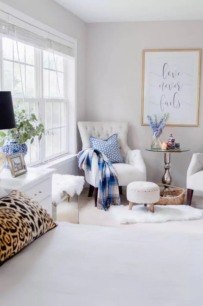
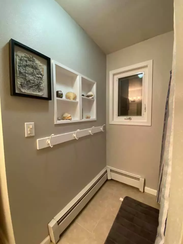
Repose Gray In Bedroom
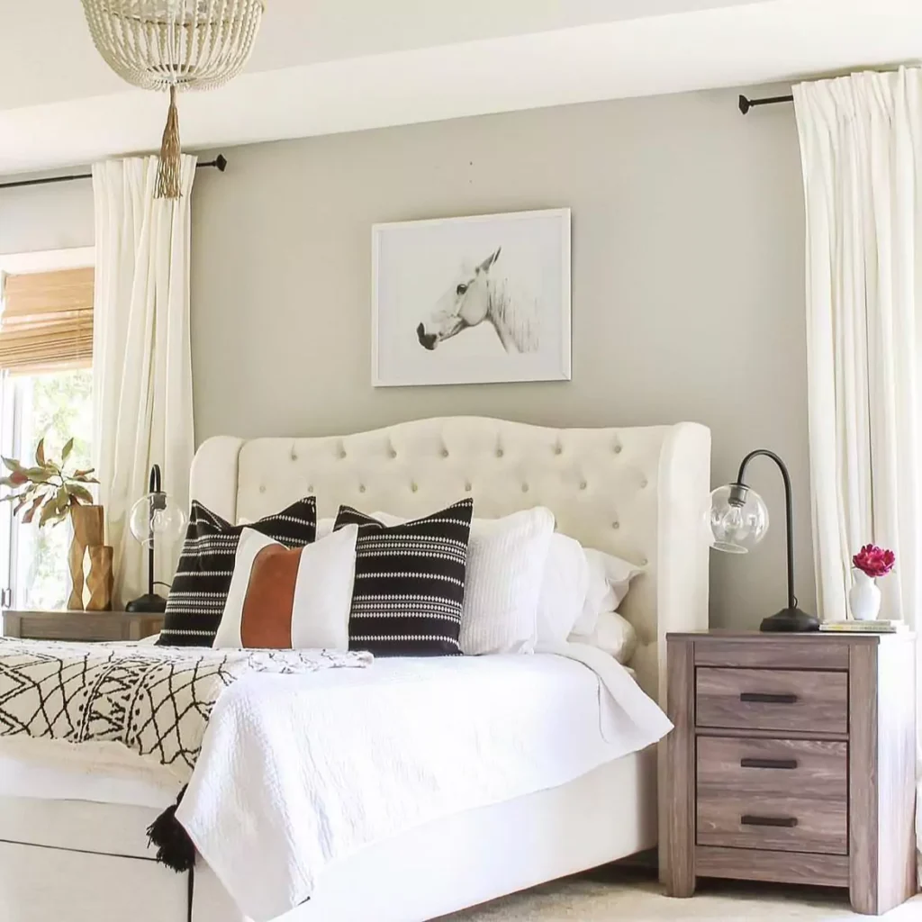
In a bedroom, Repose Gray makes a space feel calm and peaceful. It’s soft and not too bright, so it helps a bedroom feel cozy and gentle. The color pairs well with white trim or pastel decor.
Repose Gray on the walls with white furniture; the room looks quiet and comforting. Designers often choose it for bedrooms because it’s “soft and tranquil” and lets bedding and art stand out.
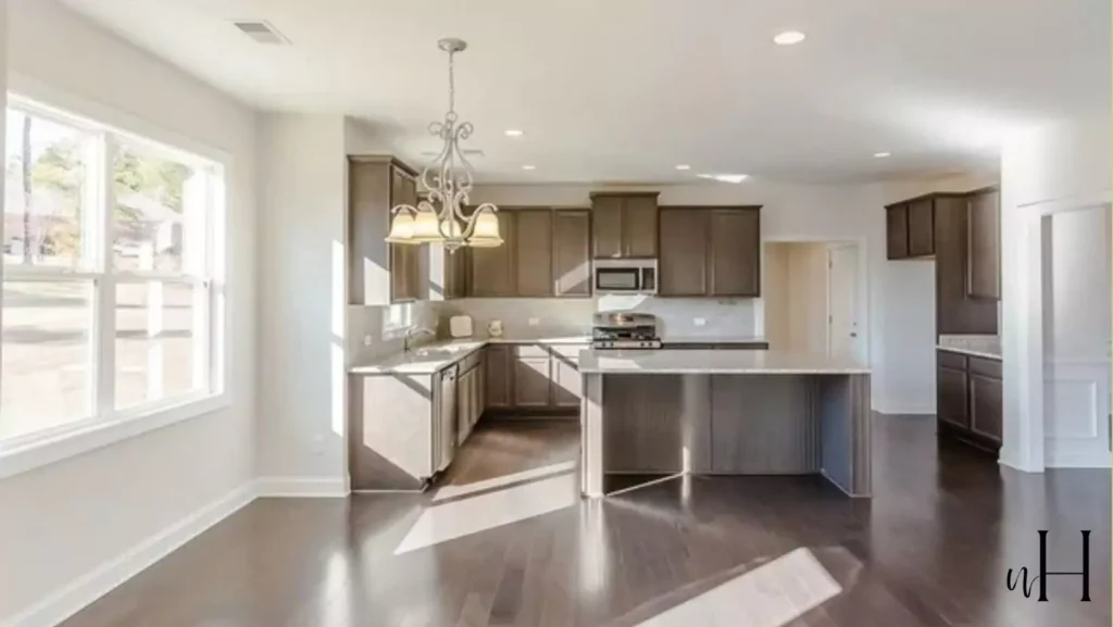
Repose Gray In Kitchen
In the kitchen, Repose Gray provides a clean, modern backdrop. It looks good with both light and dark cabinets. Many people paint white or light-colored cabinets and trim to contrast with Repose Gray walls.
(The photo above even shows it with warm wood cabinets and granite counters – it still looks fresh.) It pairs especially well with white tile, marble or light counters to keep the space bright. In general, designers say Repose Gray “creates a tailored, finished look” in kitchens and dining areas.
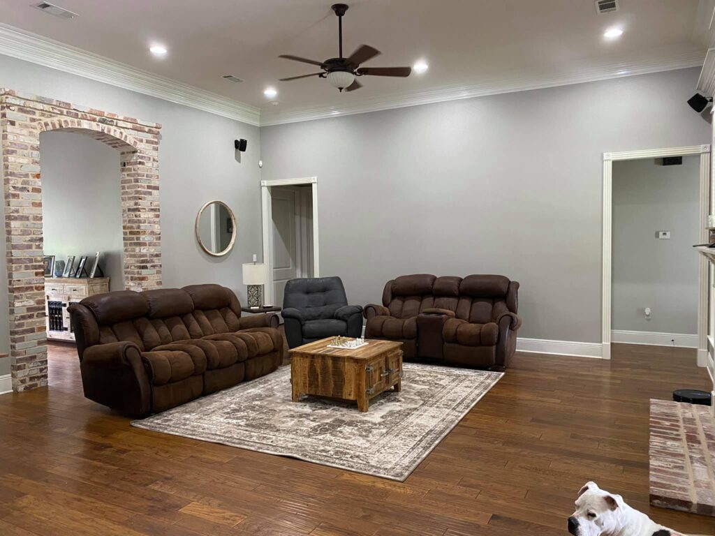
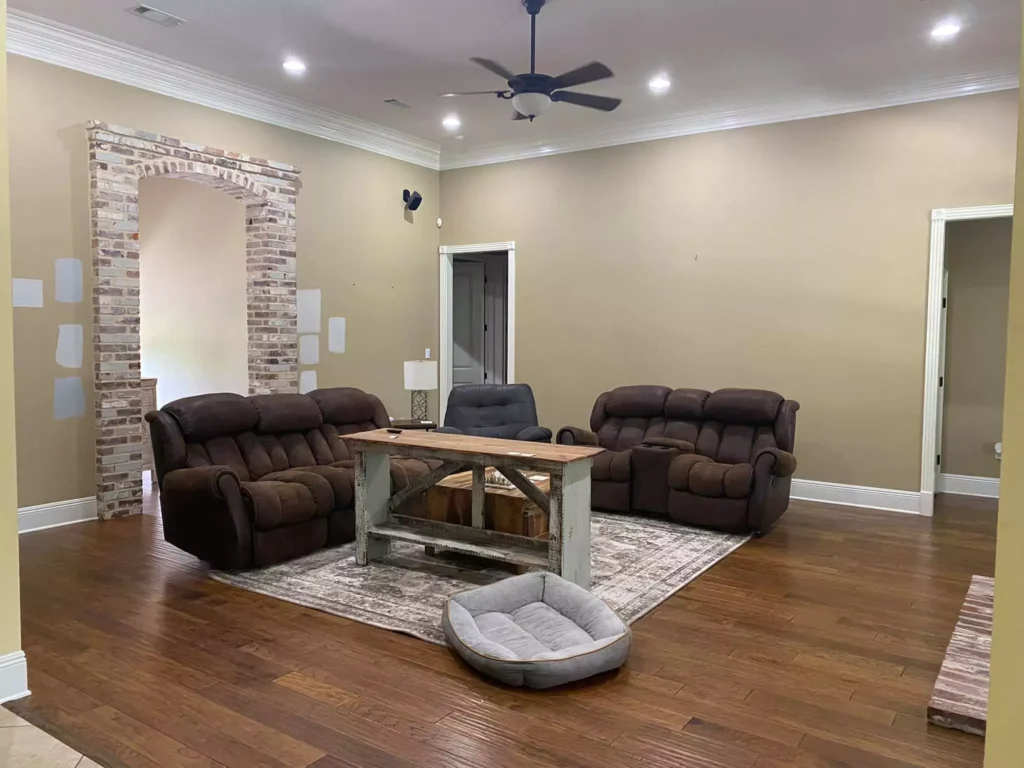
Repose Gray In Living Room
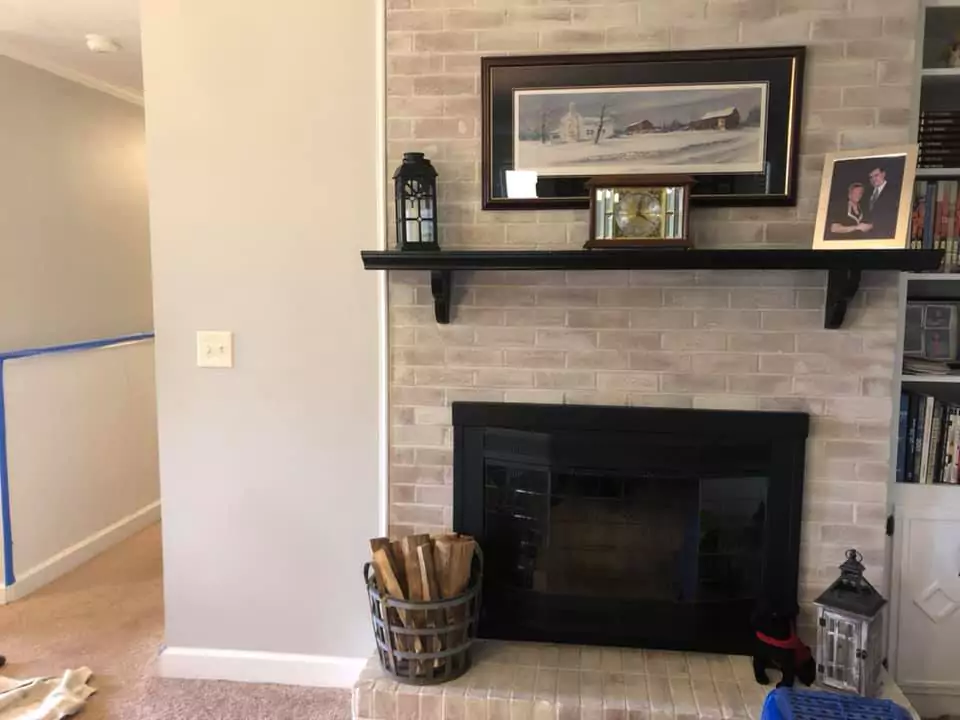
In a living room, Repose Gray acts as a gentle, neutral background. It does not fight with furniture or accents.It makes living rooms feel “calm” and “elegant” without overpowering the space.
It works with warm wood floors or cool metal details alike. Many people use it in open living areas because it ties the space together while still feeling inviting.
In Bathroom
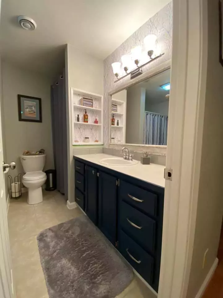
Repose Gray can also work very well in bathrooms. Because it is light, it makes a bathroom feel open and clean. It pairs nicely with white tiles or marble countertops, giving a crisp, spa-like look.
It isn’t as cold as pure gray, so it keeps the room feeling warm and approachable. Designers note that Repose Gray helps a bathroom look “crisp and clean” when used with white fixtures. It’s a popular choice for bathroom walls or vanities for this reason.
Repose Gray Cabinets

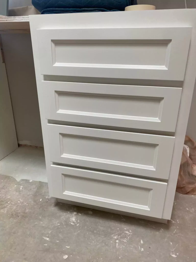
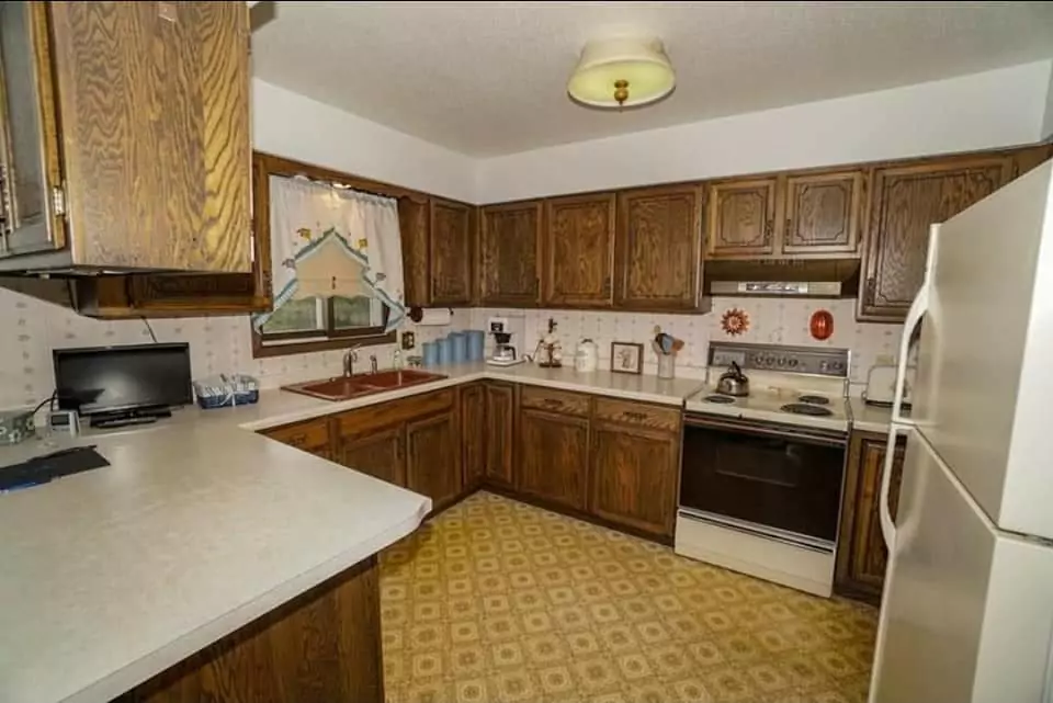
Repose Gray is often used on cabinets themselves, not just walls. Many DIYers paint their kitchen or bathroom cabinets with Repose Gray for a modern feel. One of my friends painted all her old oak kitchen cabinets “Repose Gray” and said the paint “went on like butter”. The result was a light gray kitchen that feels warm and rustic.
Using it on cabinets (especially with white walls or shiplap) can make a room look updated and pulled together. It works on kitchen islands, bathroom vanities, built-ins, or any woodwork you want to update.
Exterior
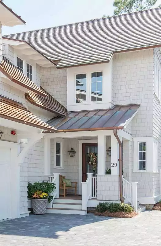
Repose Gray is also approved for exterior use. On the outside of a house, it gives a sleek, contemporary look. It pairs well with white trim, brick, or stone. For example, some modern homes use it on siding or shutters. Because natural sunlight is strong outdoors, it’s important to test a sample, but generally it remains a soft gray outside.
Using Repose Gray on the exterior for a cool yet warm effect. In short, it can be a great neutral exterior color when you want a light gray that isn’t too blue or too beige.
Coordinating Colors of Repose Gray
Soft Colors
Pure White (SW 7005) and Eider White (SW 7014) – clean warm whites for trim, ceilings, or cabinetry. These bright white neutrals keep the look soft and light.
Alabaster (SW 7008) or White Duck (SW 7010) – off-white/cream for a gentle contrast.
These give just a hint of warmth while still feeling neutral.
Mindful Gray (SW 7016) – a very light gray just a shade deeper, for walls or accent pieces. It’s the next shade on the paint strip, so it blends nicely with Repose Gray.
Bold Colors
Urbane Bronze (SW 7048) and Tricorn Black (SW 6258) – deep dark colors that create drama and contrast. Paint an accent wall, fireplace, or door in one of these to make Repose Gray pop.
Indigo (SW 6531) or other deep blue – a rich navy accent in pillows or furniture. A pop of blue looks striking against the neutral gray walls.
Coral Clay (SW 9005) or Cavern Clay (SW 7701) – warm, earthy red-orange accents. These bring energy and warmth when used sparingly (on a chair, accessories, or art).
Muted Colors
Sage (SW 2860) or Evergreen Fog (SW 9130) – soft green-gray tones that add a natural touch. These muted greens keep the space calm and earth-inspired.
Rainwashed (SW 6211) – a pale blue-green for a cool, muted feel.
It’s gentle and refreshing as an accent (pillows, towels, or décor).
Copper Mountain (SW 6356) – a subdued terracotta for a quiet warm accent.
A few ceramic pots or throws in this color add warmth without being loud.
Black Fox (SW 7020) – deep brown for grounding accents. In small doses (frames, light fixtures), it adds richness without being stark.
FAQ
Sherwin Williams Repose Gray vs Agreeable Gray
Both are warm-ish grays, but they feel a bit different. Repose Gray is slightly cooler and grayer, while Agreeable Gray is warmer and creamier. Agreeable Gray has more beige/tan in it, so it can look more “beige” in some rooms.
Repose Gray stays more neutral. (In other words, Agreeable Gray reads a bit more like a greige, Repose is more straight gray).
Agreeable Gray vs Repose Gray vs Revere Pewter
Revere Pewter (by Benjamin Moore) is another popular light gray-beige. Compared to these, Revere Pewter has even more brown/taupe and reads warmer than Repose Gray.
Revere Pewter is quite “greige” (gray+beige) and Repose Gray is a truer, cooler gray. Agreeable Gray sits in between – it has some greenish-beige undertones but is not as warm as Revere Pewter. So if you line them up: Revere Pewter is the warmest (more brown), Agreeable Gray is next (balanced greige), and Repose Gray is the coolest (more pure gray) of the three.
Which is better, Agreeable Gray or Repose Gray?
It depends on the look you want. Designers say Agreeable Gray is slightly warmer and softer, so it feels cozier with warm woods. Repose Gray is a bit cooler and more neutral, so it feels a touch more modern.
Neither is objectively “better” – it comes down to your lighting and decor. For example, if your room is very sunny or has pinkish floors, Agreeable Gray might look a bit brown, in which case Repose Gray could be a better (cooler) match.
What is the most popular gray color for interior walls?
Among Sherwin-Williams colors, Agreeable Gray (SW 7029) has been one of the top-selling grays. In fact, a 2025 survey ranked Accessible Beige #1 overall and Agreeable Gray #2 among all SW colors.
Repose Gray is also very popular (often in the top 10). But if you ask designers, Agreeable Gray is often named as the favorite “greige” neutral for walls.
What is one shade darker than Repose Gray?
On the SW paint strip, the next darker shade is Mindful Gray (SW 7016). Mindful Gray has an LRV of about 48, so it’s noticeably darker but in the same gray family. It’s a good choice if you like Repose Gray but want a slightly deeper neutral for an accent wall or darker cabinets.


