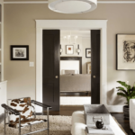
Sherwin-Williams Analytical Gray (SW 7051) is aperfect neutral greige (gray-beige) paint color. But for me I observed that it shows more beigy and pinkish cast sometimes.
But it balances warm and cool tones – blending gray and beige – and is often described as a designer favorite neutral.
Sherwin-Williams lists Analytical Gray as suitable for both interior and exterior use. Cuz its prefect choice for warm and cool paint undertones in one paint.
Most of the Designers use it widely in modern, farmhouse, Scandinavian, and traditional styles because it provides a subdued backdrop that works well with natural materials (wood, stone) or crisp whites.
In a living space, Analytical Gray creates a calm, grounded canvas; on the exterior, it gives a home a warm, sophisticated look.
So in this blog i will share my personal experience with Analytical Gray ,its undertones,LRV ,in diffrent lights and room with REAL HOME IMAGES.
Divine White SW 6105 Sherwin Williams– Quick Review

Undertones of Analytical Gray
Analytical Gray is classified as a warm gray with subtle undertones. In reality, A faint olive/greenish cast to this greige color. Others describe it as having a beige or taupe tone that softens the gray. Umm TBH, sometimes pinkish cast.
In either case, its undertones prevent it from feeling too stark or blue. This means Analytical Gray pairs best with other warm neutrals and earthy finishes.
For example, Analytical Gray “doesn’t lean too heavily into blue,” and instead can appear slightly taupe in warm light.
In sum, expect Analytical Gray to read as a gentle warm gray – carrying a hint of green/beige – rather than a pure cool gray.
LRV of Analytical Gray

Analytical Gray has a medium LRV. Sherwin-Williams specifies an LRV of about 47.5.
(This means it reflects roughly 47% of light, which is moderate for a neutral.) In practical terms, this LRV is darker than many light grays or off-whites (which often run above 60) but lighter than true charcoal or deep grays.
For example, Agreeable Gray (SW 7029) is noticeably lighter, while darker grays like Gauntlet Gray (SW 7019) have LRVs closer to the mid-30s.
As a “light-medium” value, Analytical Gray provides a substantial sense of depth on walls while still keeping a room fairly bright.
Liveable Green SW 6176 Sherwin Williams-My Review
Appearance in Different Lighting
Analytical Gray’s appearance shifts with lighting. In low or indirect light, its depth becomes pronounced: the color can look quite dark (even charcoal-like) when a room is dim.
In bright natural light, its warmer beige/green undertones emerge, giving walls a soft warm glow. Under cool or fluorescent light, Analytical Gray may swing toward a cleaner gray tone, masking some of the warmth.

For example, designers advise testing this color on large posterboard swatches and observing it throughout the day.
“In a room with very little light… Analytical Gray is going to come across as very, very dark. In a room with more natural light…
it will hold its own.” Similarly, another guide explains that with ample daylight, Analytic Gray’s beige or pinkish hints show up, whereas in low/artificial light, cooler blue-green hints may appear.
In summary, expect it to look warmer and lighter in bright light and deeper and cooler in dim light – so always test it in your specific lighting conditions.
HEX Code
The official hex code for Sherwin-Williams Analytical Gray is #BFB6A7. This hexadecimal value represents a balanced mix of red (BF), green (B6), and blue (A7) in standard sRGB space.
In practice, this hex is a muted, warm gray-beige. Designers can use this code for digital renderings or to match paint chips online. (In CSS or graphic design, #BFB6A7 will reproduce the same gentle greige tone.)
RGB Values

Sherwin-Williams lists the RGB values for Analytical Gray as R = 191, G = 182, B = 167. This confirms it is a subdued, warm gray (with slightly higher red/green than blue).
The numbers (191,182,167) correspond exactly to the hex above. In decimal terms, these mid-range values result in a color that is neither very dark nor very light.
For comparison, pure white is (255,255,255) and pure black is (0,0,0). Analytical Gray’s RGB places it solidly in the mid-tone range – matching its medium LRV.
Analytical Gray Bedroom
Analytical Gray is well-suited to bedrooms. Its soft, muted tone creates a calm, restful atmosphere. “Its soft, muted tone is perfect for bedrooms.”
In a bedroom, it can be used as the main wall color paired with bedding and accents.
For example, light bedding in whites or ivory, warm wood furniture, and textured fabrics can balance Analytical Gray walls to keep the room cozy.
Pastel or neutral accent pillows and art enhance the serenity; alternatively, a deep accent wall or dark headboard can add drama against the gray backdrop. Because of its warmth, Analytical Gray also harmonizes with beige or blush accents in textiles.
Overall it promotes a restful retreat: pairing it with soft greens or pale blues (like Sea Salt SW 6204 or Rainwashed SW 6211) for a cozy vibe .
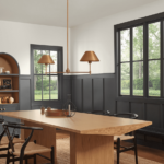
Use in Kitchen

In kitchens, Analytical Gray provides a neutral backdrop that complements cabinets, counters, and tile. It’s dark enough to add sophistication yet light enough not to feel heavy in a kitchen space.
Sherwin’s designers point out that Analytical Gray “serves as an excellent backdrop for cabinetry, countertops, and tile” and it “pairs well with brushed nickel or matte black hardware.”
Practically, this means if you have white or wood kitchen cabinets, Analytical Gray walls will make them stand out crisply. It also works as a cabinet paint itself (see below).
For example, stainless appliances and a white marble backsplash look sharp against Analytical Gray walls.

Alternatively, pairing it with warm butcher-block counters or taupe/granite surfaces accentuates its beige undertones. When using it in a kitchen, designers often use ample lighting (recessed or pendants) to keep the space bright.
Overall, Analytical Gray in a kitchen adds an updated, versatile neutral that ties together wood tones, whites, and metallics in a balanced way.
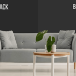
Use in Living Room

Analytical Gray works beautifully in living rooms and common areas. It creates a welcoming and relaxed ambiance, especially when combined with warm woods and soft fabrics.
For instance, a living room with Analytical Gray walls can be styled with a mix of plush cream-colored sofas, warm wood floors or furniture, and textured throws or rugs to add coziness.
The gray serves as a neutral anchor, allowing accent colors (throw pillows, artwork) to stand out. In a painting guide, designers recommend pairing it with ivory trim and taupe or leather furniture for an elegant look.

Its medium depth also means it can highlight architectural features – for example, painting a fireplace surround or built-in shelving in Analytical Gray against lighter walls creates subtle contrast.
Overall, as a living room wall color, Analytical Gray offers a refined neutrality: it keeps the space bright enough for socializing, yet warm enough (thanks to its undertones) to feel comfortable and inviting.
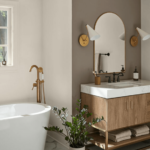
Use in Bathroom


Analytical Gray is a great choice for bathrooms of any size. In a powder room, its depth adds drama; in a full bath, it creates a clean, spa-like feel. It pairs naturally with white or cream tile and trim.
For example, Analytical Gray walls combined with crisp white subway tile and a white vanity give a fresh, modern look. Sherwin’s experts note it “serves as an excellent backdrop” in kitchens and bathrooms – the same principle applies in baths.
Its warm undertone means it complements wood-veneer vanities and natural stone counters (beige marble or gray granite) nicely.

For a monochromatic theme, white wainscoting or chair rail can break up the gray walls, highlighting the color. Moisture-friendly finishes (semi-gloss enamel) in Analytical Gray also hide dirt well.
In summary, Analytical Gray in bathrooms delivers a polished, neutral background that works with both warm fixtures (bronze hardware, tan stone) and cool accents (chrome fittings, green plants).
Use on Cabinets

Analytical Gray can be used directly on cabinetry for a sophisticated painted-cabinet look. It’s rich enough to give depth to kitchen or bathroom cabinets yet neutral enough to coordinate with countertops and hardware.
In practice, designers often pair Analytical Gray cabinets with light quartz or marble counters and matte-black or stainless pulls.
Sherwin-Williams notes that this color “pairs well with brushed nickel or matte black hardware”; that advice holds whether the gray is on the walls or the cabinets.
For example, kitchen base cabinets in Analytical Gray with white upper cabinets can balance light and dark. The slightly warm beige tone keeps the gray from feeling too cold on a large surface.

One benefit of using it on cabinets is that it ties into the home’s other gray elements (walls, trim) for a cohesive look. If used on built-ins or bathroom vanities, pairing with crisp white trim (Westhighland White SW 7566 or Snowbound SW 7004) gives a clean edge.
As always, test a large panel on the cabinet surface to see how the color reads under your lights – but in general, Analytical Gray creates a modern, elegant cabinet finish.
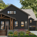
Use on Exterior

Analytical Gray is rated for exterior applications, so it can be used on siding, brick, or trim outside. Its subdued greige tone lends a modern, sophisticated feel to home exteriors.
A common approach is to use Analytical Gray on the main walls and pair it with crisp white trim (for example, Sherwin’s Snowbound SW 7004 or Westhighland White SW 7566).
The white trim highlights the gray and defines windows and doors. Accent colors (like a deep navy or black front door, black shutters, or even a red door) can then be added for interest.
For instance, navy or forest-green doors/shutters pop beautifully against a gray facade. On stone or brick homes, Analytical Gray ties together natural textures with painted surfaces.
It works especially well in sunshine – bright light brings out its beige warmth – while in shade it reads as a cool modern gray.
Overall, Analytical Gray on the exterior creates a versatile neutral backdrop.
Its moderate depth and warm undertone make it more forgiving on a large scale than a flat gray, and it complements landscaping and architectural details without clashing.
Coordinating Colors
Analytical Gray coordinates with a wide spectrum of other Sherwin-Williams colors.
Key complementary shades include both crisp whites, other grays, and accent hues.
Crisp Whites
Extra White (SW 7006) or Pure White (SW 7005) – Very bright, clean whites for trim or accents.
These sharp whites highlight Analytical Gray’s warmth and provide high contrast (for example, white crown molding or cabinets against gray walls).
Layered Grays
Dovetail (SW 7018) and Gauntlet Gray (SW 7019) – Deeper gray neutrals that layer well.
Dovetail is a rich, warm gray, and Gauntlet is a dark charcoal. Used on an accent wall or furnishings, they create a monochromatic scheme.
Lighter Greige
Agreeable Gray (SW 7029) – A lighter greige with the same gentle greenish undertone. Agreeable Gray can be used in adjoining rooms or as a ceiling color for a subtle tonal effect.
Pastel Greens/Blues
Sea Salt (SW 6204) and Rainwashed (SW 6211) – Soft pastel greens/blues.
Sea Salt (a pale green) and Rainwashed (a pale blue-green) add a gentle hint of color that still reads as neutral. They complement Analytical Gray’s warmth and keep a space calm and airy.
Warm & Cool Whites
Westhighland White (SW 7566) and Snowbound (SW 7004) – Warm or cool whites.
Westhighland is a creamy white that pairs softly; Snowbound is a bright cool white that creates a crisp contrast. Both are excellent for trim, doors, or accent pieces.
Navy Blue
Naval (SW 6244) – A deep, saturated navy blue. This classic blue provides dramatic contrast against gray. Used on an accent wall, front door, or decorative accessories, Naval pops nicely with Analytical Gray.
Black Accents
Tricorn Black (SW 6258) – Pure black for bold accents. Black window frames, railings, or furniture against gray walls create a modern graphic look.
Earthy Browns
Oak Leaf Brown (SW 7054) and Adaptive Shade (SW 7053) – Earthy muted browns. These warm brown-neutrals echo wood tones; use them on furniture or trim to bring out Analytical Gray’s beige side.
Terra-Cotta Accent
Studio Clay (SW 9172) – A rich terra-cotta. As a warm accent (pillows, small furniture), this clay color adds depth and cozy richness to a gray palette.
Each of these coordinate because they share Analytical Gray’s warm undertone or provide balance: whites and lighter grays brighten and highlight it, cool blues and greens tone it down, and deep/navy or black provide striking contrast.
When choosing coordinating colors, consider the room’s light and mood – soft pastels for tranquility, bold colors for energy, or layered neutrals for a sophisticated monochrome look.
Soft Coordinating Palette
For a gentle, airy palette, pair Analytical Gray with pale neutrals and muted pastels. Recommended Sherwin-Williams colors include:
- Sea Salt (SW 6204) – A very light green-gray that brings out Analytical Gray’s warmth.
- Rainwashed (SW 6211) – A soft aqua/blue-gray that adds a hint of color without overwhelming.
- Agreeable Gray (SW 7029) – A lighter greige cousin that shares Analytical Gray’s undertone.
- Westhighland White (SW 7566) – A warm, creamy off-white for trim or accent walls.
- Snowbound (SW 7004) – A clean, bright white for sharp contrast and maximum light.
These choices maintain a cohesive soft look. The light greens and blues (Sea Salt, Rainwashed) highlight the gray’s beige tint, while the off-whites keep the scheme bright. A soft palette like this is ideal for a serene living space or bedroom where a gentle, unified color story is desired.
Bold Coordinating Palette
For bold contrast and drama, select deep, saturated accents. Good Sherwin-Williams options are:
- Naval (SW 6244) – A rich, inky navy blue for a strong accent wall or front door. It makes a bold statement against the gray.
- Tricorn Black (SW 6258) – Pure black trim, doors, or cabinetry hardware. Black details pop against Analytical Gray’s warm tone.
- Silken Peacock (SW 9059) – A vivid teal/blue-green that adds vibrant energy.
- Enduring Bronze (SW 7055) – A deep, warm bronze-gold for a luxurious accent.
- Studio Clay (SW 9172) – A warm terra-cotta/brick red to introduce rich earthy depth.
These bold colors work because they create high contrast.
The deep blue or black elements will “ground” a room with Analytical Gray, while jewel-like hues (teal, terra-cotta) add visual excitement.
Use them sparingly – for example, on an accent wall, bold art pieces, or decorative pillows – to make a space feel lively and modern.
Muted Coordinating Palette
A muted or earthy palette emphasizes nature-inspired tones. Coordinating Sherwin-Williams colors include:
- Oak Leaf Brown (SW 7054) – A soft, muted tan that echoes warm wood grains.
- Adaptive Shade (SW 7053) – A subdued brown-gray for subtle layering.
- Useful Gray (SW 7050) – A lighter warm gray that keeps the scheme from feeling heavy.
- Dovetail (SW 7018) – A medium-dark warm gray that adds richness without stark contrast.
- Gauntlet Gray (SW 7019) – A deeper warm charcoal for weightier accents.
These muted tones complement Analytical Gray by staying in the neutral family.
They are ideal for creating cozy, nature-inspired rooms. For instance, use Oak Leaf or Adaptive Shade on accent pieces (throw blankets, planters) and Useful Gray or Dovetail on larger furnishings.
This palette maintains visual interest through layered neutrals rather than bright color, resulting in a sophisticated, toned-down look.


