
Last updated on September 5th, 2025 at 01:41 pm
Before writing about every color ,I observe the paint in different areas, on my laptop screen with a focus on what I’m feeling,what undertones are sharp,and what that specific paint is looking in living area with no natural light ,and how it works with bright natural sunlight.
Does that paint have a specific vibe to be in my bedroom? And many more questions are running around my nerves. After this, all i feel myself able to write about is Paint Color.
So, for Gray Screen a beautiful and fresh grayish powder blue color, i can tell you that its perfect for those who want refreshment in your space. Its warm and bright and cool too … Shocked? I was too. As its LRV is 59 so its more towards the lighter shade.
I am sharing REAL HOME IMAGES to explain my point ,Hope this will help you to get your color analysis. I always try to give my reader quality content with full information so they dont have to explore other blogs for more research.
Other GRAY COLORS Options
- 18 Blue-Gray Paint Colors by Sherwin-Williams & Benjamin Moore
- Intellectual Gray SW 7045 -Sherwin-Williams
- Sherwin Williams Repose Gray vs Agreeable Gray: Which Gray is Right for You?
What are the Undertones of Gray Screen ?
Sherwin-Williams Gray Screen (SW 7071) is a true neutral gray with subtle cool blue undertones. Its deep blue hint gives the color personality, making it feel fresh rather than flat.
Gray Screen gives a gray, slightly icy cast in a north-facing room but in bright, warmer light, its blue undertones become soft and more subtle to feel them.
In short, if I tell you, its blue notes are more obvious and gray is just to make the balance for your entire room.
This versatility means it complements both bold accents and warm neutrals without seeming beige or green.
What is the Light Reflectance Value (LRV) of Gray Screen?
Gray Screen has an LRV of 59, placing it in the medium-light range. An LRV of 59 means it reflects a fair amount of light – it will look light and crisp on walls, helping spaces feel open.
Because of this moderate reflectance and its cool undertones, Gray Screen can even create an optical sense of a larger room. In very well-lit rooms (especially south- or west-facing), it will appear brighter and cleaner, whereas in dim or north-facing rooms it may read as a bit more shaded or “stormy”.
As one source notes, Gray Screen “reads light enough in a room, looking crisp, chilly, and quite refined”.
Appearance in Different Lighting
Lighting dramatically affects Gray Screen’s appearance. In bright natural light, it shows as a true light gray with only a soft cool cast, and the blue undertone becomes very subtle.
In contrast, under warm incandescent or warm LED light, the blue bias of Gray Screen is subdued and the color can feel more neutral and slightly cozier.
Under cool artificial light (cool LED or fluorescent), its blue undertones are highlighted, making the shade look crisper and cooler. In shadows or dim light, Gray Screen shifts darker and more muted – it loses some of its vibrancy and reads a deeper gray with hints of blue subdued in the shadows.
Overall, Gray Screen is best in rooms with balanced or ample light; too little light can make it look gray and dull, while good natural light brings out its cleaner character.
Gray Screen in different rooms
In the Bedroom
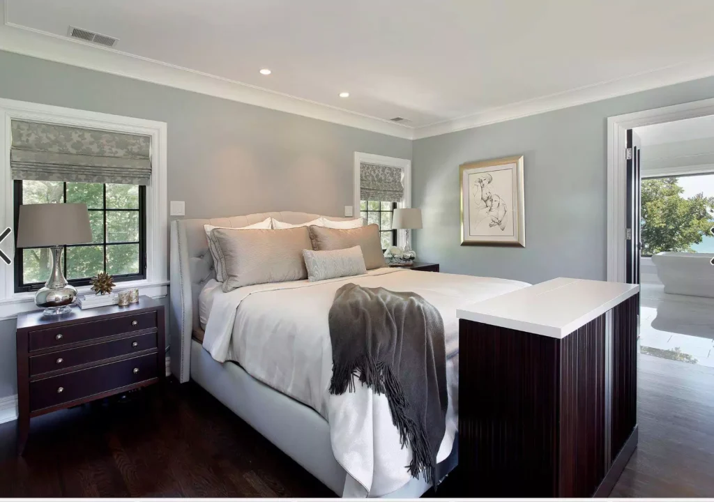
SW 7071 Gray Screen makes a bedroom feel calm, cool, and composed.You should not forget while painting that its blue undertone is still present, so pairing Gray Screen with crisp white trim and accents helps balance the depth.
For example, white bedding and moldings will accentuate the true gray base.
In the Kitchen
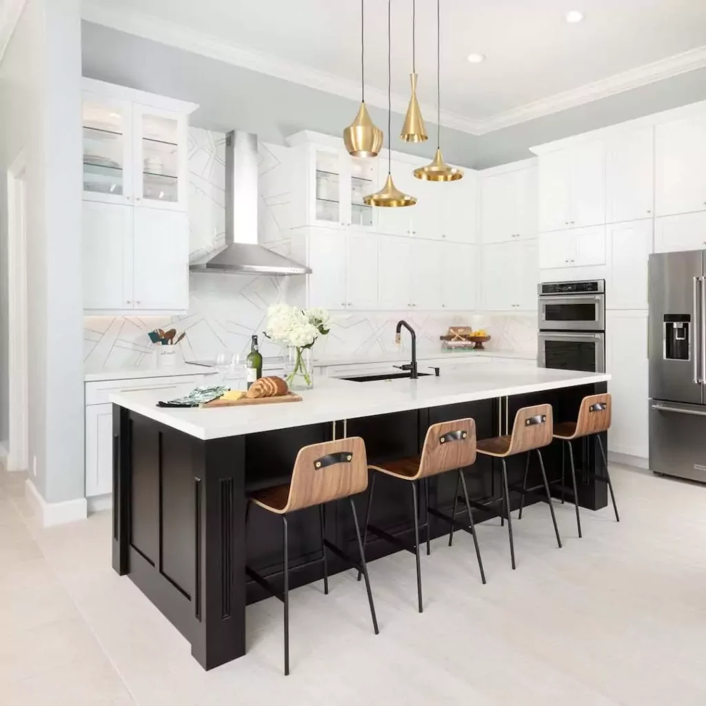
Gray Screen works beautifully in a kitchen, giving a fresh, airy vibe to the space. Its cool neutral tone complements most cabinet styles and hardware. In contemporary kitchens, you can paint walls or even cabinetry with Gray Screen to achieve a clean, modern look.
For a striking and bold effect, consider a two-tone design – for example, Gray Screen on upper cabinets or walls and a bold color on lower cabinets.
Alternatively, Gray Screen pairs well with white subway tile, chrome fixtures, and stainless-steel appliances. Its cool crispness makes even a large or darker kitchen feel more spacious.
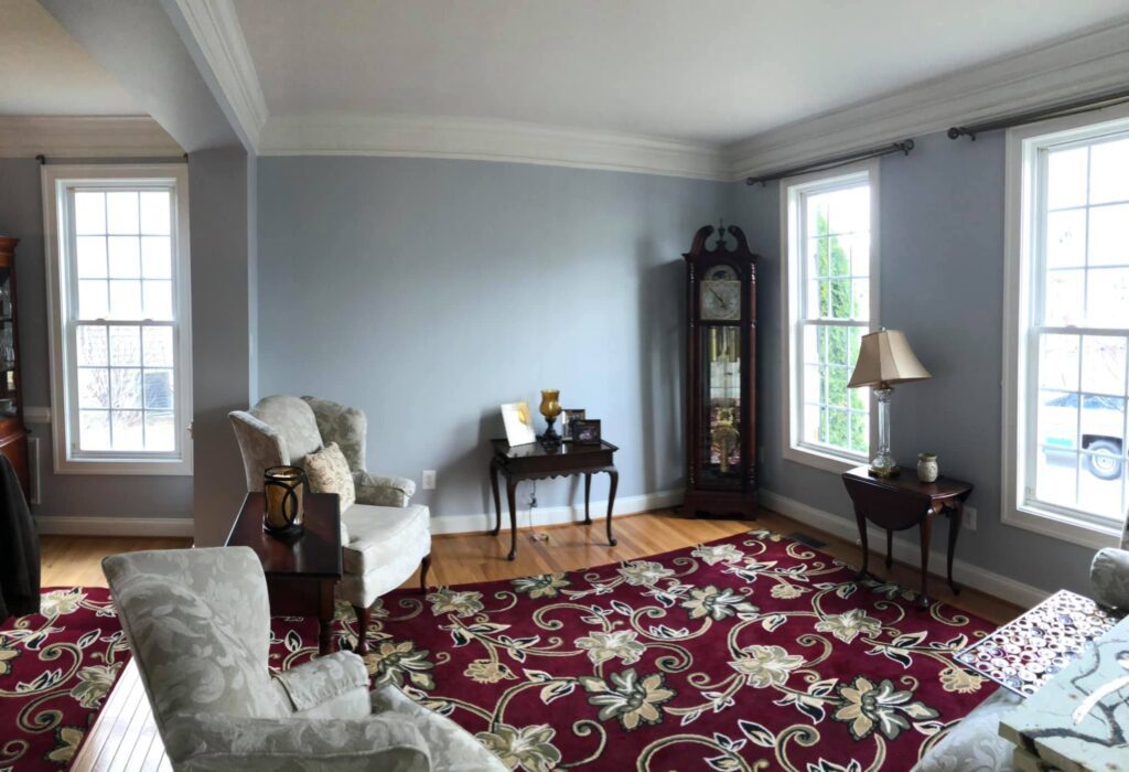
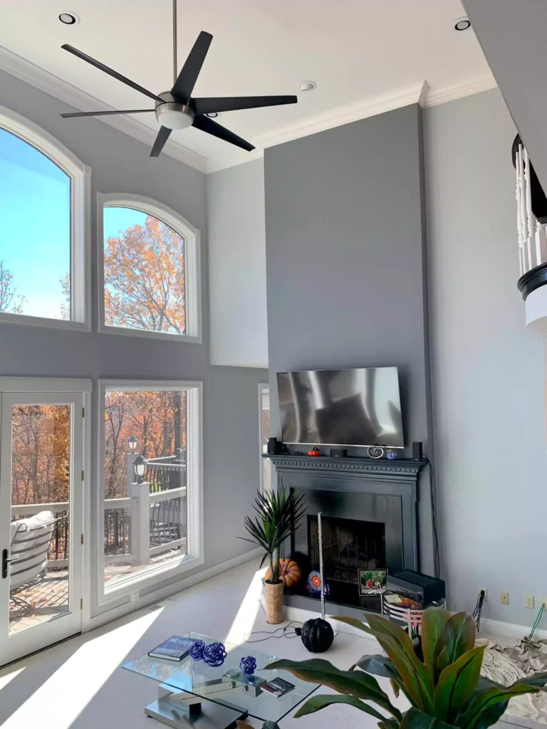
In the Living Room
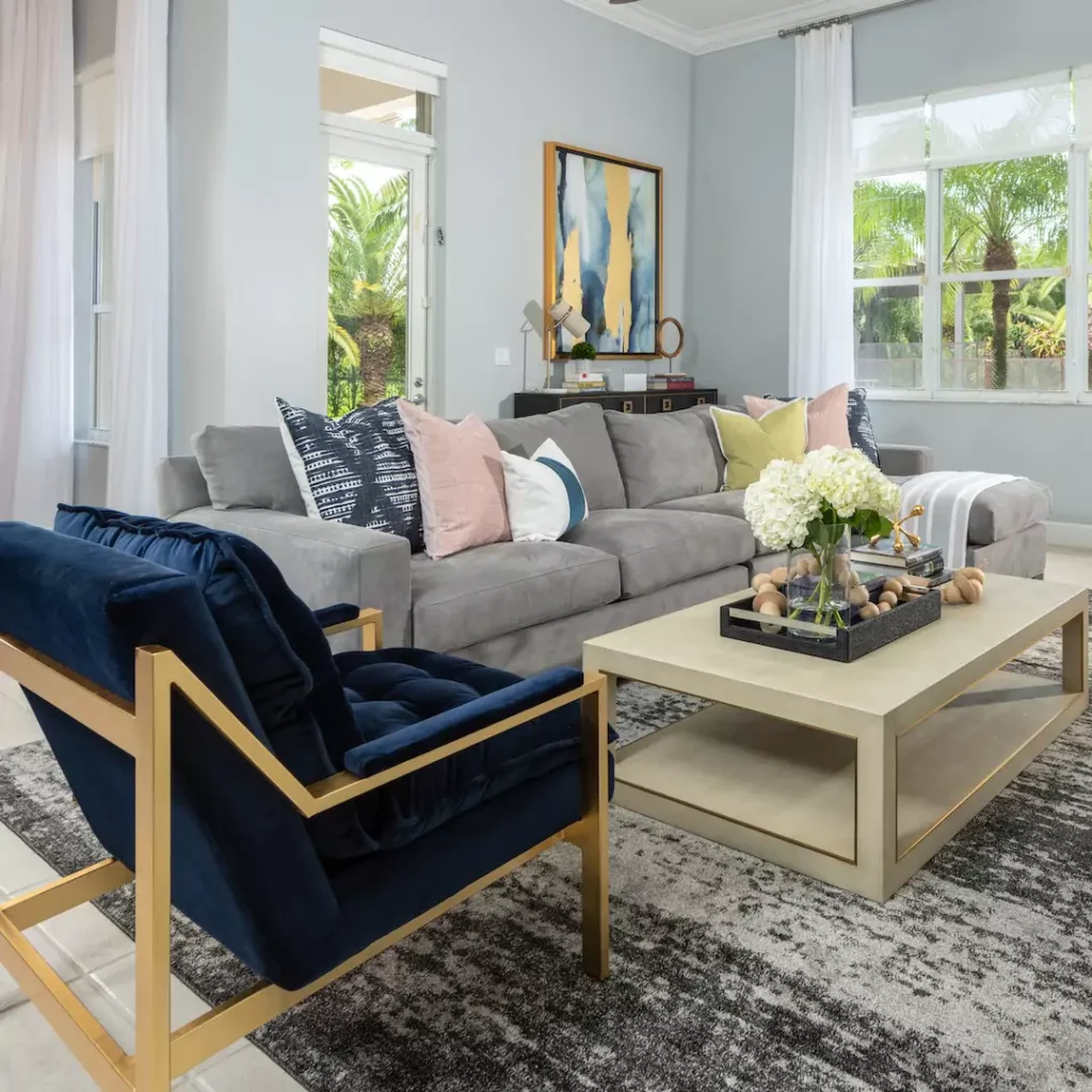
When used in living rooms, SW 7071 provides a light, modern neutral that can anchor bold accents. You can safely paint all walls this pale gray, then introduce contrast with accent walls or furniture. But I recommend going with White furniture pieces.
For retro or contemporary look you can use colors like mustard yellow ,red and navy blue shades.
In the Bathroom
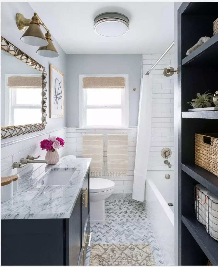
SW 7071 is an excellent choice for bathrooms due to its crisp, clean look. Its slight coolness works well with white tile and porcelain. In a medium or large bathroom with good light, you could even paint all walls Gray Screen for a spa-like feel.
If your bathroom is smaller or feels too cold, you should use Gray Screen on just one wall or the vanity cabinetry and keep the rest of the walls bright white. Gray Screen’s cool tone will make the room feel fresh and modern, and it looks more fresh and modern with bright white contrast.
For even more brightness, use glossy finishes (like high-gloss paint or tile) on one of the Gray Screen walls – this reflects more light back into the room. In short, Gray Screen in a bathroom reads as a soothing cool gray; it won’t make the space feel tiny because of its medium LRV, and its neutrality pairs with almost any bathroom hardware or tile choice.
On Cabinets
Gray Screen can be used on kitchen or bathroom cabinets for a sleek, modern look. It works especially well on lower cabinets in a two-tone scheme. For example, painting base cabinets Gray Screen and leaving upper cabinets or walls white brightens the space while adding contrast.
The cool tone of Gray Screen pairs beautifully with white countertops and backsplash. In my opinion: “For a modern kitchen, Gray Screen can be used on walls, cabinetry, or even as part of a two-tone design. Pair it with white subway tile and stainless-steel appliances to complete the look.”.
In a bathroom, painting the vanity Gray Screen sets a sharp backdrop for chrome fixtures. The overall effect on cabinetry is contemporary and sophisticated – the color looks clean and crisp, yet its blue undertone keeps it from feeling flat.
Exterior Use
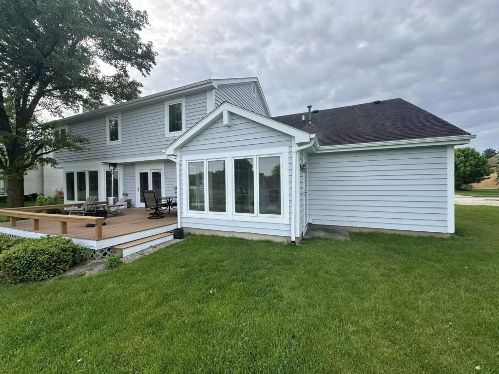
Gray Screen is versatile enough for exterior paint. It’s a popular choice for Craftsman, Ranch-style, Mid-Century Modern, and transitional homes. Used on siding or brick, it gives “a timeless and elegant vibe”.
For the exterior, Gray Screen reads as a soft, neutral gray that complements natural surroundings. It pairs especially well with black or charcoal trim and accents – for instance, a black front door, dark gray roof, or deep trim will pop against Gray Screen walls. Crisp white trim or fascia also highlights its true tone.
In sunlight, Gray Screen’s subtle blue cast is barely noticeable, so it looks like a classic cool gray. Overall, Gray Screen on the exterior creates an elegant curb appeal that doesn’t go out of style.
Coordinating Colors for Gray Screen
Gray Screen coordinates beautifully with crisp whites and a range of accents. For trim and moldings, pure whites are ideal: Sherwin-Williams Extra White (SW 7006) or Pure White (SW 7005) will make the gray appear its truest and brightest.
These bright whites ensure the blue undertones don’t dull or look muted. Beyond white, Gray Screen works with many soft blues, greens, and grays. A soft blue-green like Coastal Plain (SW 9162) or Contented (SW 6191) adds a gentle, calming palette.
Muted blues like Rain (SW 6219) or Bracing Blue (SW 6242) create a serene mix. Richer accent colors – such as deep navy (Naval SW 6244) or mustard yellow (Lemon Twist SW 6909) – will stand out against the neutral gray for drama.
For a monochromatic palette, pair Gray Screen with other cool grays from the Sherwin-Williams Technology™ series (e.g. Network Gray SW 7073 or Repose Gray SW 7015) for depth.
In general, coordinated colors should either echo the coolness of Gray Screen (soft blues/greens and grays) or provide a warm contrast (rich navy, mustard, or coral) depending on the mood you want.
Soft, Muted Palettes
Gray Screen shines with soft, muted colors for a tranquil scheme. Think pale neutrals and pastels: warm off-whites or creams (like Restoration Ivory SW 6118) keep the look gentle.
Light blues or aqua-greens – for example, Misty SW 6232 or Sea Salt SW 6204 – enhance Gray Screen’s cool serenity without overpowering it.
Colors like Mountain Air and Labradorite (soft blue-greens) complement Gray Screen in a “muted and calm” palette. Muted sage or gray-greens (like Evergreen Fog SW 9130 or Rainwashed SW 6211) also work harmoniously.
These soft tints maintain the subtlety of Gray Screen, making the space feel cohesive and relaxing.
Bold Accent Colors
For bold accents, Gray Screen can handle strong pops of color. Navy blue (Naval SW 6244) is a natural choice – it’s deep enough to create contrast without clashing.
Bright yellow or gold (Lemon Twist SW 6909) adds energy, as does a vibrant orange or coral (e.g. Coral Reef SW 6606) for a playful touch. Even mustard or ochre pillows and decor can warm up the look.
You could also introduce bold textures – a statement rug or velvet sofa in jewel tones (teal, plum) will pop against Gray Screen. Bold grays (like cityscape or charcoal) can be used as an accent wall to add drama.
In short, Gray Screen’s neutrality makes it an excellent backdrop for saturated colors – they won’t clash with beige or warmth, but will stand out crisply.
Muted Accent Colors
Pairing Gray Screen with other muted, earthy tones yields a sophisticated palette. Subdued hues like silvery sage, soft teals, and warm grays blend seamlessly.
For example, sage green (Evergreen Fog SW 9130) or a gentle blue-gray (Repose Gray SW 7015) have a similar cool character without high contrast.
Creamy ivories (Restoration Ivory SW 6125) and greige neutrals (Agreeable Gray SW 7029) also work in a low-key palette. These muted companions ensure the room feels calm and cohesive, letting Gray Screen’s subtle elegance show through.
FAQs
Does Sherwin Williams’ Gray Screen look blue?
Gray Screen is inherently a cool gray with subtle blue undertones. In certain lighting (especially cooler light or north-facing rooms), you may notice a faint bluish tint. However, it rarely looks vividly blue; it generally reads as a neutral gray with only a whisper of blue. Using warm lighting or warmer accent colors can minimize any bluish feel if desired.
What is the most beautiful shade of gray?
“Most beautiful” is subjective, but Gray Screen is often praised for its balanced cool tone and versatility. Designers love it for its clean, modern look that doesn’t lean too purple or brown. Other popular grays include Agreeable Gray (warm greige) and Repose Gray (neutral), but Gray Screen’s sleek, contemporary neutrality makes it a top contender for those who prefer a crisp, slightly cool gray.
Color Comparisons
Lazy Gray (SW 6254) vs. Gray Screen (SW 7071)
Both are cool grays, but Gray Screen is lighter and slightly more blue-leaning, while Lazy Gray is deeper with a stronger blue-gray cast. Gray Screen has an LRV of 59 (a bit higher than Lazy Gray’s ~53), so it reads lighter on the wall.
According to paint experts, Gray Screen shows both green and blue undertones but favors blue, whereas Lazy Gray is a “very cool, moody color” with strong blue undertones. In practice, Gray Screen feels fresher, and Lazy Gray feels a touch stormier.
Gray Screen vs. Misty (SW 6232)
Misty is a soft, light gray with a more pronounced blue undertone. Both share a cool tone, but Misty is slightly lighter and cooler. For example, Misty’s LRV (~64) is higher than Gray Screen’s 59, so Misty will look brighter and crisper on the wall.
Misty’s “cool, muted blue” ambiance, while Gray Screen is neutral-cool. The result: Misty feels like a gentle blue-gray, whereas Gray Screen stays more neutral with only a subtle blue hint.
Passive (SW 7064) vs. Gray Screen
SW Passive is a neutral gray with a very slight warm (yellow-green) bias. In comparison, Gray Screen leans a bit more greenish-blue (hue ~180). The two are close in lightness (Passive LRV ~60 vs. Gray Screen 59).
In other words, Passive may read slightly warmer or more muted, while Gray Screen is a touch cooler and more saturated. One paint guide notes that Passive’s blue undertones are more muted, whereas Gray Screen’s blue tint is more pronounced.
Evening Shadow (SW 7662) vs. Gray Screen
Evening Shadow is very close to Gray Screen but a hair lighter. Its hue (195) is a bit more toward blue, while Gray Screen’s hue (180) is slightly greener. Evening Shadow’s LRV is ~60 (versus Gray Screen’s 58.6), so Evening Shadow will appear a tad brighter.
In practice, Evening Shadow reads as a cool gray-blue, whereas Gray Screen is essentially that shade just a bit darker and less blue-leaning. The difference is subtle, but Evening Shadow will be the lighter, cooler of the two.
Gray Screen vs. Reflection (SW 7661)
Reflection is a lighter, lower-contrast gray. Its LRV (~66) is higher than Gray Screen’s 59, so it shows as noticeably lighter. Reflection’s hue value is around 120 (a warm greenish tone) compared to Gray Screen’s 180 (true cyan/green).
This means Reflection feels a bit warmer/greener and is very unsaturated, whereas Gray Screen is cooler and slightly more saturated. In short, Reflection is the paler, softer gray; Gray Screen is deeper and cooler with more visible undertone.


