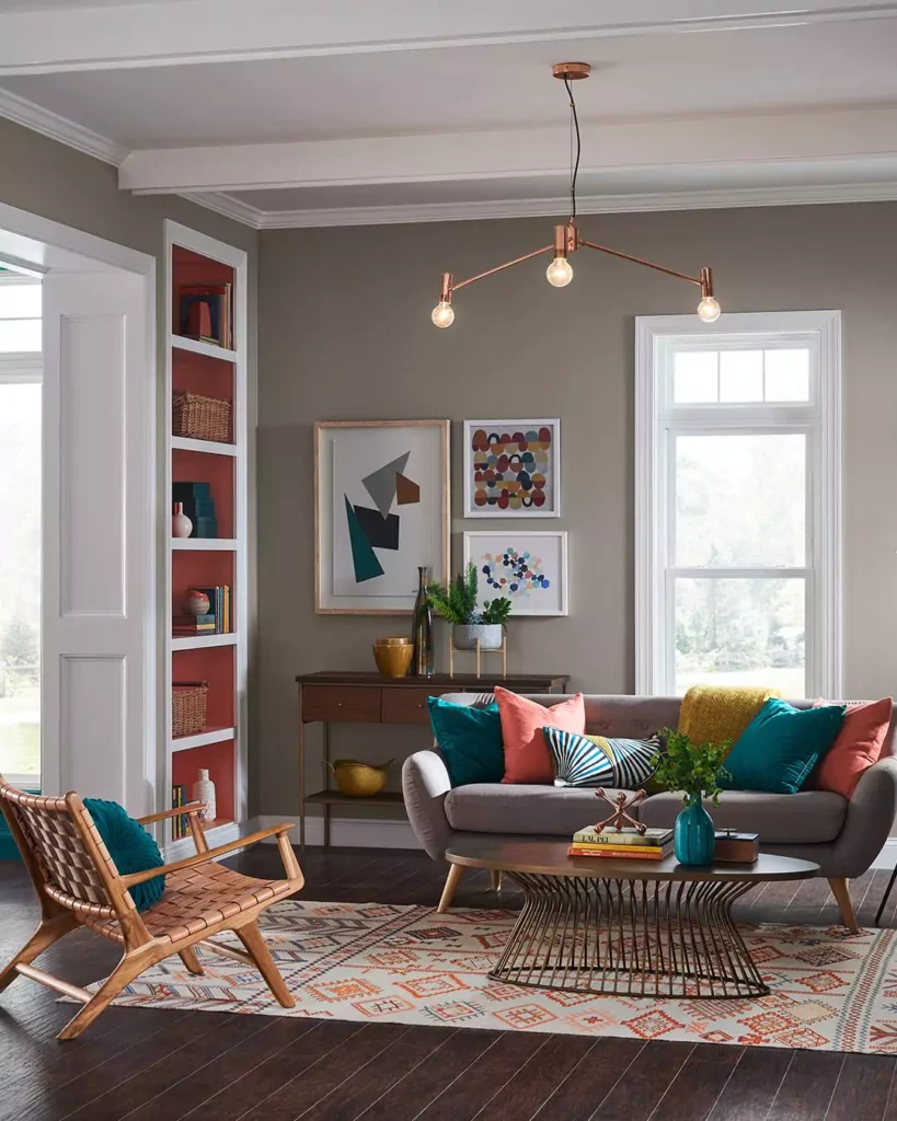
Choosing the right paint color can completely transform a space, and when it comes to choosing neutrals, greige (a blend of gray and beige) is one of the most popular choices.
And also its most difficult color to choose between cuz they have many different undertones ,that are warm and cool,and that makes a huge difference.
Sherwin-Williams offers a wide range of greige tones, from soft and airy shades to rich and dramatic hues, making it easy to find the perfect fit for any room.
In this guide, I will share Top 10 Sherwin-Williams Greige Paint Colors, highlighting their undertones, best uses, and standout features to help you pick a shade that complements your style and space.
And if you wanna read a full review about a specific color, then I’m also mentioning link to that specific blog so you can reach it easily.
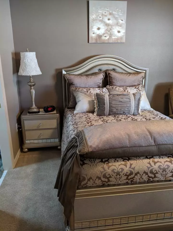
1. Agreeable Gray (SW 7029)
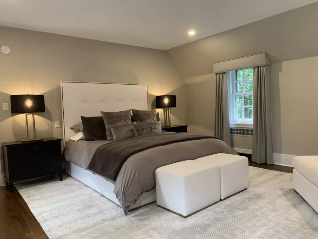
Agreeable Gray is a light greige that strikes a perfect balance between warm beige and cool gray, making it a true neutral.
It’s often cited as an “ultimate crowd-pleaser” for its adaptability – it works in nearly any lighting condition or style.
This versatile hue is popular for whole-house use as well as walls, trim, and cabinets; designers note it integrates seamlessly with warm woods, cool metals, and virtually any accent color.
In short, Agreeable Gray’s even undertones and broad appeal are why it’s consistently one of the best-selling Sherwin-Williams greiges.
Accessible Beige vs Agreeable Gray-Popular Paint Color Could RUIN Your Home
Lean
Balanced neutral (neither strongly warm nor cool).
Uses
Interior walls, trim, cabinets – often chosen as a “whole-home” color for living rooms, bedrooms, and hallways.
Features
Light, adaptable greige with mild green/gray undertones; pairs with almost any color scheme. Highly popular (many designers call it a go-to neutral) because it “won’t let you down” in different lights.
2. Accessible Beige (SW 7036)
Accessible Beige is a warm-leaning greige (more beige than gray) that still feels soft and neutral. It “leans slightly warmer” than typical gray-beiges, giving rooms a cozy but never tan or yellow look.
This creamy greige is recommended for interior walls and trim and pairs beautifully with both dark and light accents.
For example, it’s often used on wainscoting, doors or shutters contrasted against white walls, creating elegant trim work.
Accessible Beige’s popularity comes from its versatility – it never looks flat white or too golden, and it complements everything from bold furnishings to classic whites.
My Review:Accessible Beige(SW 7036) by Sherwin-Williams- After Year of Testing
9-Black Goes Well with Accessible Beige Sherwin Williams-Selected by Interior Experts
10 Popular Sherwin Williams Accessible Beige Exterior Color Combinations
Lean
Warm (beige-taupe) neutral.
Uses
Great on interior walls, trim, and cabinetry. Frequently used for wainscoting or trim paired with white walls to create contrast.
Features
Soft, inviting greige with subtle beige undertones; “wraps a space in warm embrace” without looking yellow. Works well with dark-stained wood or bright accents, making it a versatile backdrop.
3. Colonnade Gray (SW 7641)
Colonnade Gray is a medium-toned, cooler greige. It “leans a little more gray” than many greiges, giving it a cleaner, more modern feel.
Homeowners often use it as a whole-house neutral or in formal rooms; it’s shown to work in dining rooms, offices, or living areas where a calm, balanced backdrop is desired.
Notably, Colonnade Gray is sometimes compared to Benjamin Moore’s Revere Pewter – Sherwin-Williams describes it as “slightly darker and a bit more gray” than Revere Pewter.
Its neutral depth and restrained green/gray undertone make it very adaptable to furnishings and trim, which is why it’s ranked among the top Sherwin-Williams greiges.
Lean
Cool-neutral (more gray, with a faint green undertone).
Uses
Interior walls (especially whole-house color), accent walls, and exterior; popular for offices, dining rooms, or any space needing a relaxed, versatile backdrop.
Features
Mid-depth neutral. Complements both warm woods and cool finishes. Highly versatile – it “integrates with almost any design style,” and won’t shift dramatically under different lighting.
4. Worldly Gray (SW 7043)
Worldly Gray is a light, soft greige with a subtle warmth. It’s described as a “subdued, light greige” that creates an understated backdrop for furnishings.
Slightly deeper and warmer than Agreeable Gray, Worldly Gray works well in bright living rooms or bedrooms where a gentle, cozy feel is wanted.
Designers note that Worldly Gray lets decor “take center stage” – for example, vibrant pillows or accent pieces will really pop against this neutral wall.
Its mild green-beige undertone provides a clean, modern look that can be accented with colorful or neutral furnishings, so it’s often chosen for living spaces and exteriors alike.
Lean
Neutral with a touch of warmth (light greige).
Uses
Interior walls, trim, and even kitchen cabinets or exteriors; ideal for rooms needing a soft, subtle neutral. It’s one of the lightest greiges, often used in living rooms and offices.
Features
Very light value, “quiet” greige. Slightly warmer than Agreeable Gray, it provides a “clean, modern look.” Worldly Gray is famed for letting colorful decor shine while still feeling warm and timeless.
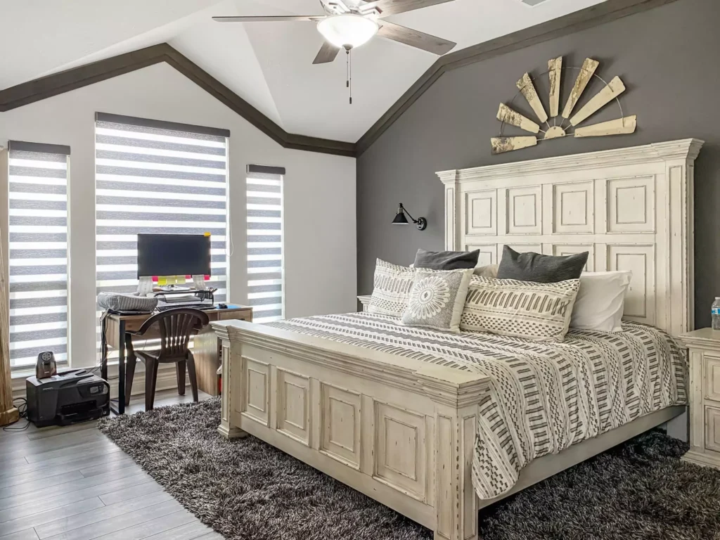
5. Anew Gray (SW 7030)
Anew Gray is a richer, earthy greige with noticeable warmth. Sherwin-Williams calls it a taupe-inspired hue with “a touch of warm color that’s ever so subtle.”
This mid-tone greige adds depth and sophistication to rooms; designers love it in kitchens, bathrooms, and entryways because it looks warm and cozy without feeling pink or brown.
Anew Gray’s warm beige undertone pairs exceptionally well with natural materials (wood floors, stone), giving spaces a cohesive, “snug and welcoming” vibe.
It sits between Agreeable Gray and Mega Greige on the Sherwin strip, making it a versatile middle tone – neither too light nor too dark – which is why it’s a top greige for both walls and cabinetry.
Lean
Warm (subtle brown/taupe undertone).
Uses
Interior walls, kitchen or bathroom cabinets, furniture. Popular in foyers and cozy rooms where warmth is desired. Also works well as a whole-house color on light-to-medium walls.
Features
Rich, earthy greige. Adds depth without being dark. “Pairs exceptionally well with wood and stone” for a natural look. It’s highly adaptable – it’s often used on both walls and built-in cabinetry.
6. Mega Greige (SW 7031)
Mega Greige is a deeper, richer greige (medium-dark) that leans warm. According to Sherwin-Williams, its warmer tones “lean a little more yellow,” making it perfect for cozy, inviting spaces.
This color can make a bold statement: it adds depth and character to large rooms like living rooms or great rooms, where a “chic, sophisticated deeper shade” is desired.
Mega Greige also crosses over to exterior use (porches, siding) for classic curb appeal. Because it sits on the same color strip as Agreeable and Anew, it offers the same balanced undertone but in a darker value.
Its popularity stems from this versatility: Mega Greige can be a dramatic accent wall or a whole-room color, and its warm-yellowish undertone maintains comfort and contrast.
Lean
Warm (noticeable yellow-beige undertone).
Uses
Interior accent walls, larger living/dining rooms, and even exterior siding/trim. Works as a whole-room color in big spaces for a cozy effect.
Features
Deep greige, medium LRV. Creates a cozy, enveloping look. Excellent with light-colored decor for contrast. It’s “fantastic for exteriors” too, offering a timeless, classic look.
7. Perfect Greige (SW 6073)
Perfect Greige lives up to its name: it’s an equal blend of gray and beige. Sherwin-Williams describes it as a “balanced hue… thanks to equal parts of gray and beige.”
As a result, it reads as a true neutral that can transition between warm and cool color schemes with ease.
This makes it an excellent choice for interior walls or trim in transitional spaces (like living areas that flow into kitchens) where you might mix both cool and warm accents.
Perfect Greige’s undertone is neither overwhelmingly warm nor cool, so it pairs well with crisp whites as well as wood tones.
Its “perfect blend” is why many designers recommend it for harmonizing disparate colors – it really does act as a universal background.
Lean
Perfectly balanced neutral (equal gray/beige).
Uses
Interior walls and trim in any room. Ideal as a “safe” greige for whole-home color since it won’t skew warm or cool.
Features
Even undertones make it extremely versatile. Provides a neutral backdrop that complements both warm woods and cool metals.
Often cited as a go-to for mixing color palettes precisely because it “sets the backdrop” for other colors.
8. Alpaca (SW 7022)
Alpaca is a classic neutral greige. Sherwin-Williams calls it a “neutral greige” that “creates a softer look.”
This light-to-medium greige has subtle beige undertones and is extremely popular for interior walls and trim.
Because it is so neutral, it “complements a variety of different accent colors whether they’re light, dark or somewhere in the middle.”
Designers often use Alpaca in living rooms and bedrooms where a calm, understated wall color is desired.
Its popularity (often in the top Sherwin-Williams neutrals list) is due to this flexibility – Alpaca never clashes with furniture or decor and works in nearly any light.
Lean
Neutral (mildly warm, but very subtle).
Uses
Interior walls, bedrooms, living rooms, and trim. Also used on cabinets for a soft neutral look.
Features
Soft, light-to-medium greige. Highly adaptable – it “pulls everything together” without taking over.
Because of its lack of strong undertones, it’s often chosen when one wants a timeless beige/gray base that works with any accent.
9. Functional Gray (SW 7024)
Functional Gray is a deeper greige that is great for accents.
Sherwin-Williams notes it’s a “medium hue” that’s perfect for a more saturated look and lets your walls stand out. It leans toward the grayer side of greige but still carries warmth, making it richer than Alpaca or Anew Gray.
Common uses include accent walls, bookcases, or cabinetry – anywhere you want a neutral but more dramatic color.
Because of its medium depth, Functional Gray can highlight architectural features or create contrast in a room otherwise painted a lighter neutral.
Its popularity as a greige comes from this flexibility: it adds depth when lighter greiges aren’t enough, yet it’s less bold than a true charcoal or brown.
Lean
Warm-neutral (medium gray-beige).
Uses
Accent walls, focal points, or entire rooms (especially on walls needing more depth). Also used on kitchen/bathroom cabinets for contrast.
Features
Rich, saturated greige. Draws the eye without being very dark. Often described as a “statement” greige ideal for focal points.
10. Analytical Gray (SW 7051)
Analytical Gray is an interesting cool-toned greige. It “commits to its job” by showing a noticeable green-gray undertone. It’s a light-medium color (LRV ~47) that appears grayer than beige.
Use it on interior walls or cabinets when you want a greige that’s not too warm.
Analytical Gray is noted for its “muddy” quality – it has more obvious green in it than Agreeable or Worldly Gray – which can create a tranquil, nature-inspired feel in the right light.
It’s become one of designer Kylie M. Interiors’ favorites (her #1 greige) because it holds up well in bright and moderate lighting without shifting too warm.
Analytical Gray SW 7051 by Sherwin William
Lean
Cool (noticeably gray-green undertone).
Uses
Interior walls and cabinetry for a modern neutral. Works well in well-lit rooms where its slight green cast adds calm depth.
Features
Light-medium depth with green undertone. Stands out among greiges for its “gorgeous” gray-green hue.
Not as universally used as Agreeable Gray, but prized by many for character and depth.
Tips: Choosing Warm vs. Cool Greige
Greige undertones can shift dramatically with light, so always test samples in your own space.
As a general guide, cooler greiges (with gray or green undertones) tend to look best in bright, south- or west-facing rooms—there they won’t read too blue or flat.
Warmer greiges (with beige/yellow or brown undertones) can make north-facing or lower-light rooms feel cozy and inviting.
Also consider your fixed elements: a warm wood floor may pull a greige warmer, whereas crisp white trim can make a greige look cooler.
In all cases, it’s wise to sample paint on multiple walls: “paint colors can look different in various lighting conditions, so it’s essential that you test a variety of colors in your room before committing to one.”


