
Last updated on September 5th, 2025 at 01:37 pm
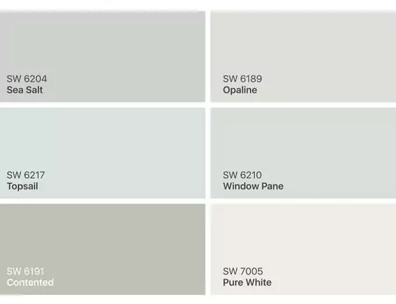
Sherwin-Williams Topsail (SW 6217) is a pale, airy blue-green paint color often used for a coastal and for refreshing vibe.
I will say it as “a soft and subtle shade of blue-green” that brings a fresh, light breeze-like vibe to any room. Topsail works well as a gentle backdrop, lending an open, relaxing feel to interiors.
Without wasting your time ,lemme tell you I will share my personal experience with topsail paint color, how it works in different rooms ,coordinating color palette with REAL HOME IMAGES.
Sleepy Blue SW 6225 Sherwin Williams:My Review
Krypton (SW 6247) Sherwin-Williams-My Review
What are the Undertones of SW Topsail
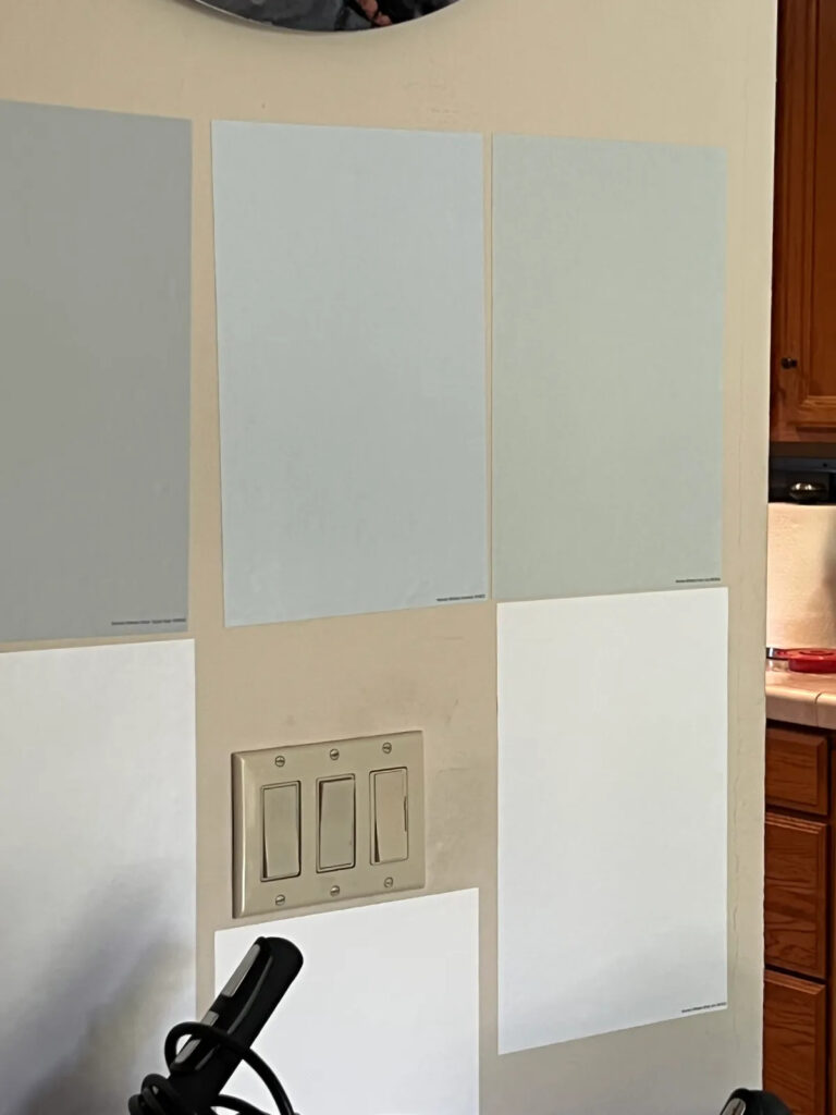
Topsail’s undertones are subtle. It is fundamentally a clean, crisp pale blue but with slight gray and greenish hints.
In bright natural light it can take on a more aqua tone, while in dimmer light its gray-green aspect shows up.
In practice, Topsail reads as a cooler, muted aqua – neither strong teal nor warm green – making it appear tranquil and coastal.
LRV of Topsail
Topsail is very light and reflective. Its LRV (Light Reflectance Value) is about 75%.
(By comparison, pure white is 100%, and a mid-gray is around 50%.) This high LRV means Topsail will brighten a room and bounce a lot of light.
In a sunlit space, it looks almost pastel-blue, whereas in deeper shade it will still be visibly bluish-white, not dull.
The high LRV also means Topsail won’t darken a space – it’ll make smaller rooms feel larger.
Appearance in Different Lighting
As with many pale blues, Topsail’s look can shift with lighting. In strong southern- or west-facing light it may pick up its greenish/aqua tint and look slightly more saturated.
Under cool or northern light it may look grayer or more muted.
Always sample it in your own lighting: it can read almost sky-blue on one wall and a pale gray-green on another depending on the light and surrounding surfaces.
Hex Code and RGB
Technically, Topsail’s color values are: HEX #D9E2DF and RGB (217, 226, 223). This places it in the very pale green-cyan family (a tiny amount of green, lots of blue and a hint of red).
The hex/RGB tell us that Topsail is much closer to blue than to green when broken into red-green-blue channels, which matches its visibly soft blue appearance.
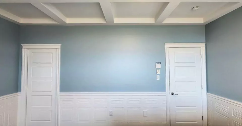
Sw Topsail Bedroom
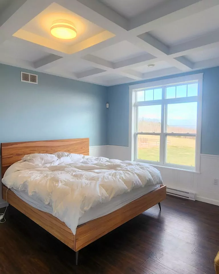
Topsail is often used in bedrooms for its soothing effect. Its soft blue-green hue creates a calm.
By pulling blue undertones into a bedroom, Topsail makes the space feel airy and peaceful.
In practice, Topsail paired with white or pale gray bedding and natural woods creates a perfect bedroom feel.
SW Topsail Kitchen
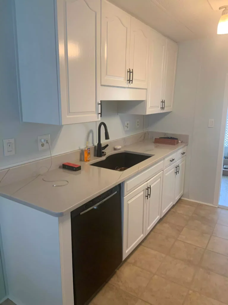
Topsail can freshen up kitchens, especially those with white or light cabinetry. It provides a gentle coastal vibe on walls or even as an accent on an island or kitchen door.
Against crisp white cabinets and subway tile, Topsail feels bright and clean. If you ask me then I will say that on cabinetry alone it can look very pale or minty, so many prefer it on walls or accents rather than full cabinets.
Overall, Topsail brings a light, breezy quality to kitchens, echoing the “sky-like” feel if used on upper walls or ceilings.
Sherwin Willaims Topsail Living Room

Topsail makes living rooms feel open and welcoming. In minimalist or modern decors, pairing Topsail walls with white trim yields a very bright, clean look.
Alternatively, pairing it with rich wood furniture or warm accent pieces adds cozy contrast.
In an open living area, Topsail helps reflect natural light around, making the room feel larger. It’s gentle enough to work as a neutral backdrop, letting colorful art or furniture stand out.
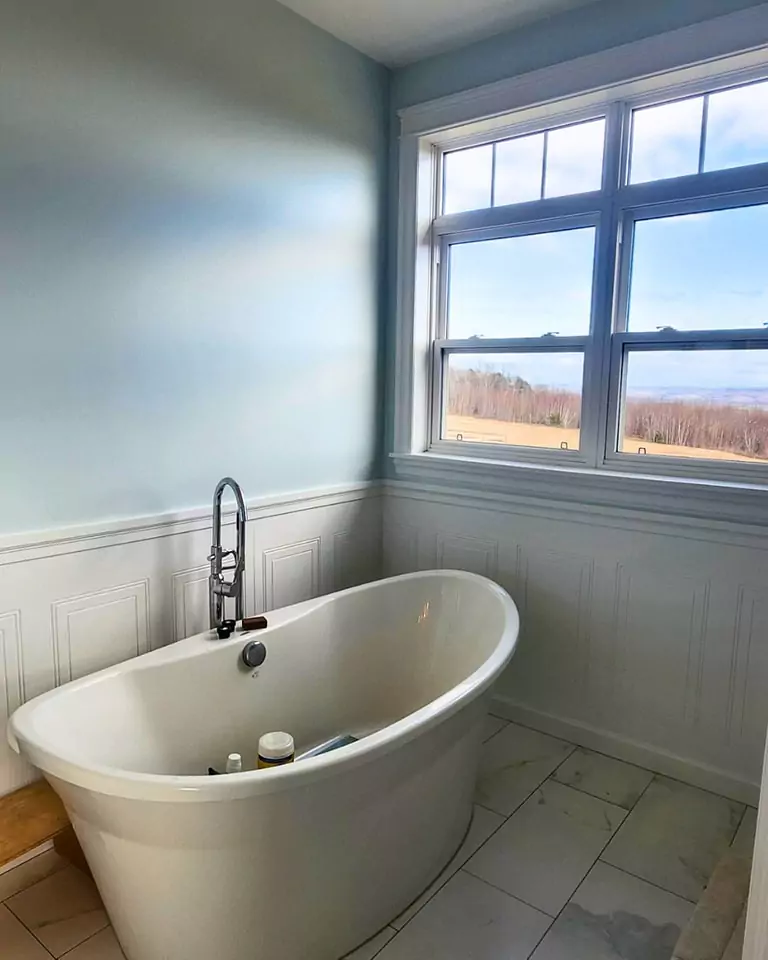
In the Bathroom
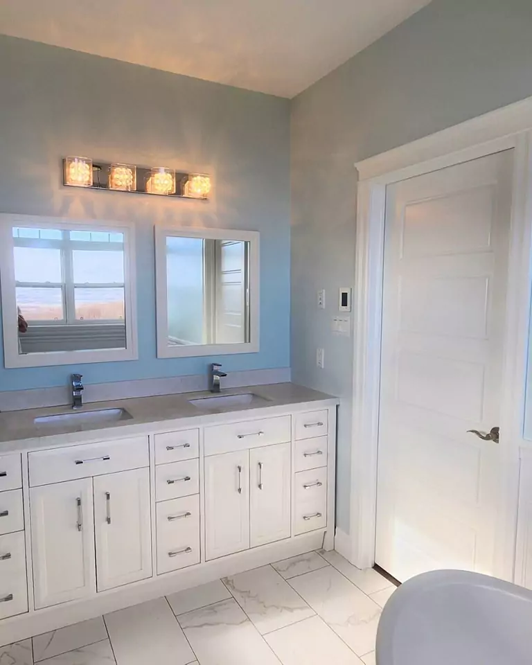
Topsail’s spa-like aqua vibes suit bathrooms well. Its high LRV helps small bathrooms feel bright, and the blue-green tone complements white tile and fixtures.
In a bath, Topsail is a serene choice – cool without feeling sterile – and it pairs especially nicely with marble/quartz counters (gray-white) or natural stone. Think a soothing seaside retreat.
On Cabinets and Furniture
For a subtle pop, Topsail is sometimes used on cabinets, built-ins, or accent pieces. Because it’s light, it won’t overwhelm cabinetry. It gives kitchen or bath cabinets a soft color without overpowering.
Try it on a built-in bookcase, island base, or even a kitchen hutch. It can also be charming on a ceiling (like a ‘haint blue’), since it’s pale enough to feel like sky.
In any case, on woodwork and furniture, Topsail reads as a delicate minty-blue rather than a bold turquoise.
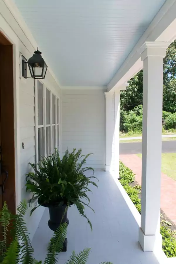
Topsail Exterior Use
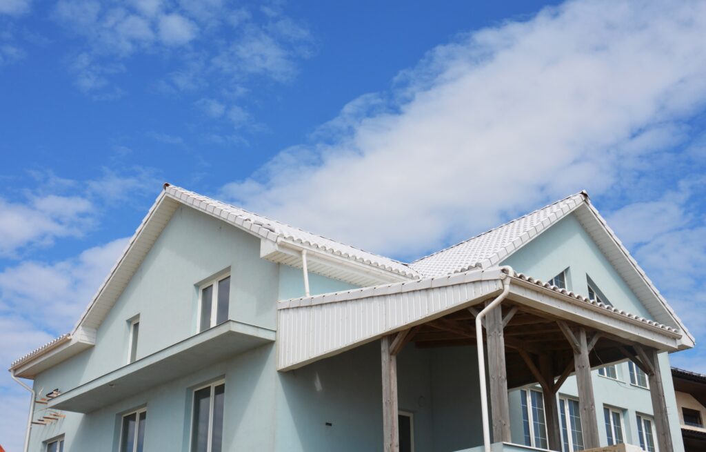
While Topsail is classified under Sherwin’s Interior/Exterior paint colors, it’s more commonly seen on interiors. Its light pastel tone means you’ll usually see it on coastal homes or beach cottages.
On an exterior, Topsail looks crisp with white trim or dark shutters. (Its high LRV suggests it can survive bright sun without looking drab.) It would be fitting for a seaside facade or as an accent on a porch ceiling (“haint blue” style).
Keep in mind very large exterior areas might require more coats for even coverage due to the light color.
Coordinating Colors of SW Topsail
Several complementary colors are often paired with Topsail to create a harmonious palette. For a bold accent, a deep teal like SW 6957 Undercool is recommended – it harmonizes “for a bold, yet calming maritime theme.”
A crisp sky-blue such as SW 6798 Iceberg also contrasts nicely (being slightly deeper). Bright white (SW 6511 Snowdrop) is a classic trim or accent that “brings out the subtle nuances in Topsail, enhancing the room’s light and airy feel.”
For a lively pop, SW 6784 Bravo Blue is suggested as an energizing companion. In general, cool whites, pale blues, or gentle teals coordinate well.
Coordinating colors for Topsail include deep teals (Undercool SW 6957), crisp blues (Iceberg SW 6798), vivid blues (Bravo Blue SW 6784), and clean whites (Snowdrop SW 6511).
Soft Color Palette
If you prefer a very soft, monochromatic scheme, use light pastels and neutrals close to Topsail’s hue. Pale airy blues like SW 6504 Sky High or SW 6497 Blue Horizon make a gentle palette.
For example, Sky High “pairs sweetly with Topsail to maintain a light, laid-back vibe.” Soft grays or greiges (like Antique White or Silver Mist) also sit quietly beside Topsail.
The idea is to pick colors that don’t fight it – think of seaside skies and distant horizons.
A soft “beachy” palette with Topsail could include other pale blues and grays (e.g. Sky High SW 6504, Dew Drop SW 9641, Mantra SW 9631, Snowdrop SW 6511) as shown.
Bold Accents
For a bolder look, layer stronger colors. Deep navy or teal accent walls or built-ins will make Topsail pop by contrast. As noted above, SW Undercool (teal) and Bravo Blue (vivid blue) are cited as striking companions.
You might also use a bold coral or sunny yellow as a playful complement – but make sure those accent pieces are limited so Topsail remains the dominant field color.
The key with bold accents is balance: a pop of rich color (navy, teal, royal blue) can energize the room, while Topsail keeps the overall feel light.
My Review:Charcoal Blue SW 2739 Sherwin Williams
Muted Tones
For an overall muted scheme, stick with pale neutrals and washed-out shades. Crisp off-whites or very pale grays (like Extra White, Repose Gray, or Snowdrop SW 6511) are excellent trims and furnishings.
Other soft pastels – think pale mint or dusty blue – can also work. Warm grays or greiges (Agreeable Gray, Sea Salt) can tone it down, too.
In a muted palette, Topsail itself often becomes the neutral backdrop, complemented by such easy, understated hues.
FAQs
Is Sherwin-Williams Topsail blue or green?
Topsail is best described as a very pale blue with green undertones – essentially a blue-green. It leans toward blue on the spectrum, appearing as a gentle minty or aqua-tinted blue.
What is the most popular blue-green paint color?
By many accounts, Sherwin-Williams Sea Salt (SW 6204) is one of the most popular blue-green shades, along with Rainwashed (SW 6211). They are frequently chosen for bathrooms, kitchens, and exteriors for their versatile muted look.
Topsail vs. Sea Salt – how do they compare?
Though similar, Sea Salt is noticeably greener and slightly darker. For example, Topsail has an LRV of ~75, whereas Sea Salt’s LRV is about 63, so Topsail is significantly lighter. Topsail reads as more blue, while Sea Salt leans a bit greener.
In short: Topsail is a brighter, bluer aqua; Sea Salt is a softer, grayer greenish-blue.
Topsail vs. Tradewind (SW 6218)
Both are coastal aquas but Tradewind is deeper. Numerically, Topsail’s hue angle is ~165° vs 180° for Tradewind, and Topsail’s LRV is ~74.9% vs 60.7% for Tradewind.
This means Topsail is much lighter and slightly less saturated, while Tradewind is richer/teal and darker. In practice, Tradewind will look like a more vivid bluish-green, whereas Topsail remains a pale, pastel aqua.
Topsail vs. Rainwashed (SW 6211)
Topsail is lighter and bluer. The hue angles and LRV illustrate this: Topsail’s hue ~165° vs Rainwashed ~136°, and LRV 74.9% vs Rainwashed’s 59.05%.
Topsail reflects more light (lighter color) and sits further toward the blue side. Rainwashed is a moodier, grayer green-blue, whereas Topsail is its airier, more pastel cousin.
Topsail vs. Mountain Air (SW 6224)
These two are very close. Mountain Air is only slightly deeper and cooler. Topsail’s LRV is ~74.9% vs 73.2% for Mountain Air, and their hues are 165 vs 173.
In practice, Topsail comes across as just a touch brighter and more subdued, while Mountain Air has a smidge more gray. Both are pale cool blues, so they’re often interchangeable, but Topsail sits on the lighter end of the spectrum.


