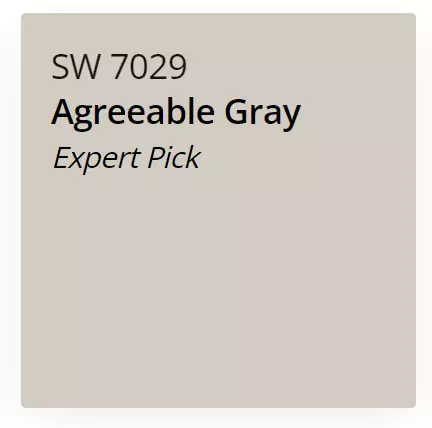
After talking about the famous beige paint colors of Sherwin Williams I m here to talk about the Agreeable Gray,which is warm ,cool ,bright and dark at the same time. It’s gray and beige at the same time, I mean PERFECT GREIGE color.
Sherwin-Williams Agreeable Gray SW 7029 is a very popular neutral paint color. It is a mix of gray and beige (often called “greige”). This color is warm and balanced – not too dark or too light.
Designers call it a “warm gray” that works almost anywhere. It’s one of Sherwin-Williams’ top-selling neutral colors because it blends well with many styles and decorations.
If you wonder what you should choose, accessible beige or agreeable gray ,im here to help you too. Accessible Beige vs Agreeable Gray-Popular Paint Color Could RUIN Your Home
Undertones of Agreeable Gray SW 7029
Agreeable Gray has very subtle undertones. It is mostly gray with a tiny bit of warmth (beige or taupe).
Experts say it “favors gray over beige.” In bright, warm light it can look a touch more beige, and in cool or low light it looks more pure gray.
Some people even notice a hint of green or a mild violet in certain lights, but these shifts are very soft.
Because its undertones are so gentle, Agreeable Gray usually reads as a neutral greige that can match both warm and cool colors.
LRV of Agreeable Gray SW 7029
Agreeable Gray has an LRV of 60. The LRV is a number from 0 (black) to 100 (white) that says how much light the color reflects. With an LRV of 60, Agreeable Gray is fairly light.
It will brighten a room but isn’t stark like white. In real terms, it looks bright enough to keep rooms feeling open, yet it still shows up as a distinct color (not washed-out white).
This makes it a good balance: rooms with lots of light will feel light and warm, while rooms with less light will still feel cozy (though very dark rooms can make it look a bit grayer).
Appearance in Different Lights
How Agreeable Gray looks can change a bit with lighting. In a sunny south-facing room it may look more beige and warm. In a north-facing or low-light room it can lean more gray.
For example, one blogger showed a bedroom where the sun made Agreeable Gray look warm and beige, but shadows in the same room made it look cooler gray.
In general, more light makes it feel lighter and warmer, while less light makes it seem darker and more grayish. Because of this, many designers recommend testing it in your own room first (try a sample paint on the wall) to see how it will look at different times of day.
Hex Code
On a computer or in design, Agreeable Gray is shown as hex code #D1CBC1. This is a six-digit code used to pick exact colors in digital formats.
RGB
In terms of RGB values (red, green, blue on a 0-255 scale), Agreeable Gray is R=209, G=203, B=193. This means it has about 82% red, 80% green, and 76% blue. Together those values make a light grayish-beige tone.
Agreeable Gray Bedroom
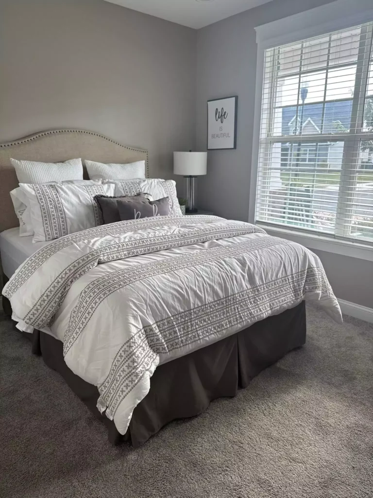
Agreeable Gray works well in bedrooms. It makes the space feel calm and cozy without being too cold. In rooms with good natural light, the walls look warm and inviting.
Agreeable Gray “provides a calming, restful atmosphere” in bedrooms. It pairs nicely with white or cream bedding and warm-toned curtains or pillows.
(For example, peach-colored curtains in a south-facing bedroom helped bring out the warmer tones of the gray.) Because it is soothing, it can make a bedroom feel like a quiet, relaxing retreat.
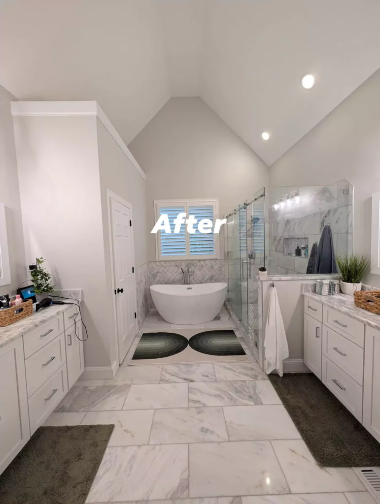
Agreeable Gray In the Kitchen
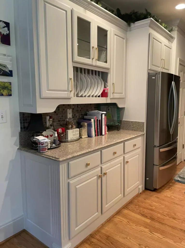
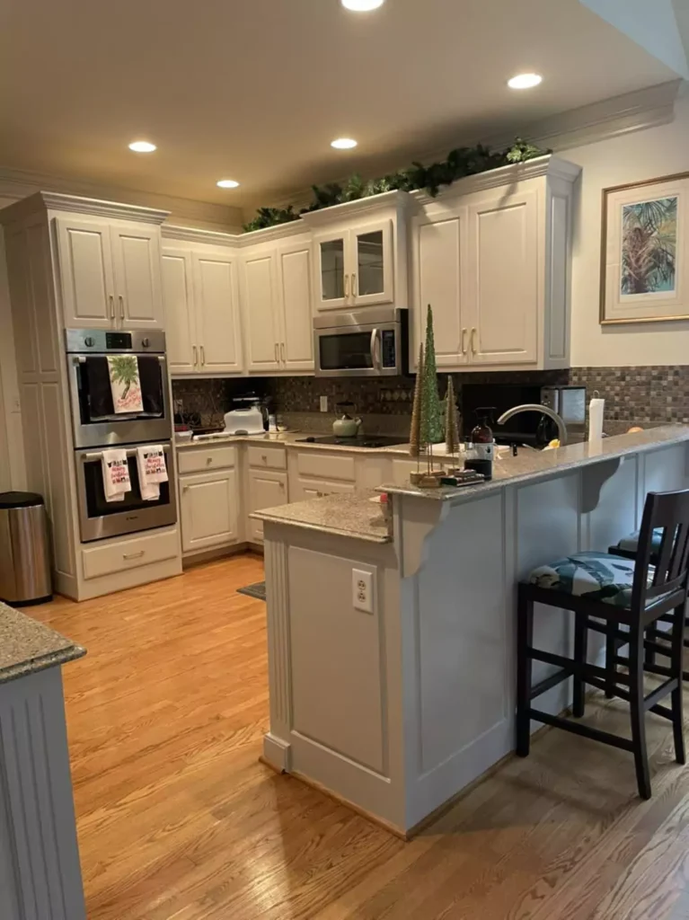
Agreeable Gray is a smart choice for kitchens too. It blends well with many cabinet and countertop colors. For instance, it “complements various cabinet colors and countertop materials.” Many people paint their kitchen walls or cabinets this color.
If you have wood cabinets or countertops, the warm undertone of Agreeable Gray looks great with brown and tan woods. It also plays nicely with white appliances or marble – everything looks balanced.
Its moderate LRV means it keeps the kitchen feeling bright without being as stark as white. Overall, it creates a clean but not overly sharp look in a kitchen.
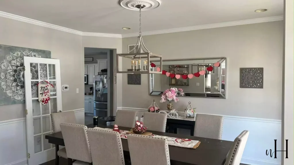
Agreeable Gray Living Room
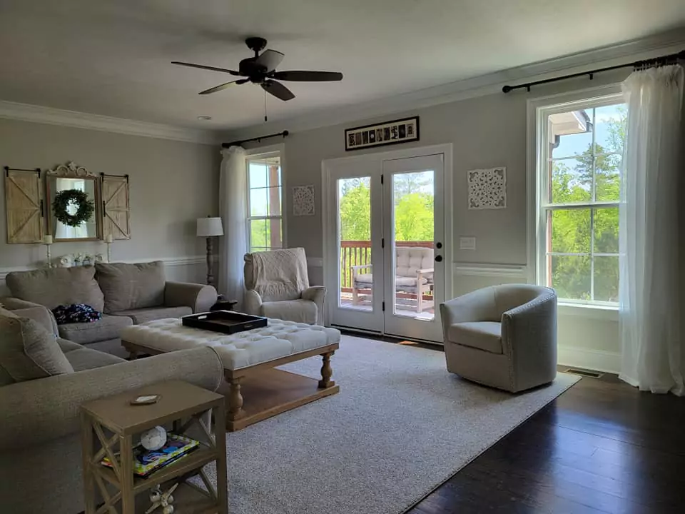
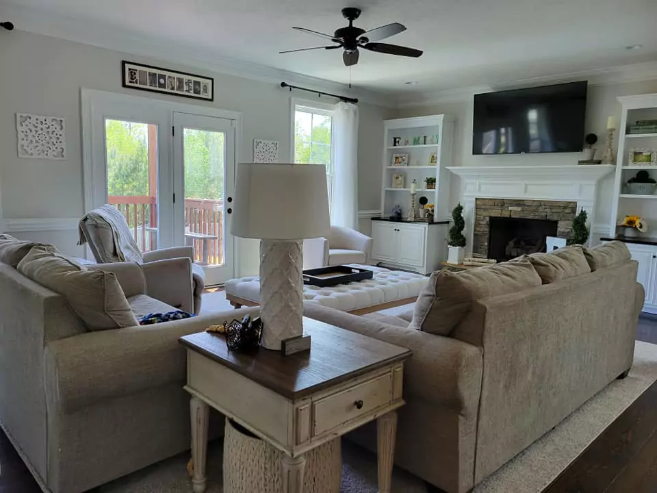
Agreeable Gray is very popular on living room walls. It serves as a “welcoming, sophisticated backdrop” that makes furniture and art stand out. In a light-filled living room, it will read as a soft light gray. In a more dim room it will feel cozier.
Because it is neutral, it goes with almost any style – modern, traditional, farmhouse, etc.
It also balances well with both light and dark furniture. For example, light-colored sofas pop against it, and dark chairs also look rich against it. Many designers say it’s a safe, warm neutral that creates a friendly living space.
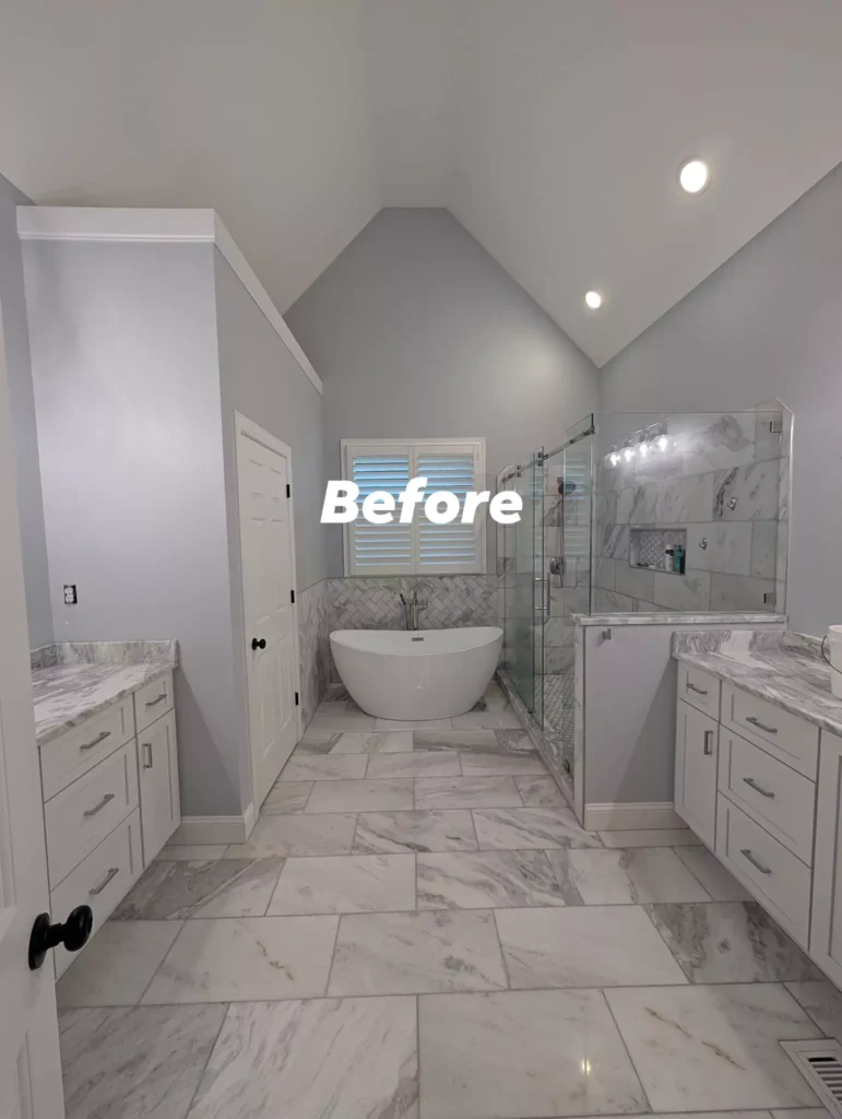
In the Bathroom
Agreeable Gray works nicely in bathrooms too. It adds warmth so the room doesn’t feel too sterile. A designer notes it “adds warmth while maintaining a clean, fresh appearance” in baths.
It goes well with white tile or white trim, making the space bright yet cozy. For example, if you have white sinks or tiles, Agreeable Gray walls will still feel crisp. Warm lighting (like golden lights) will bring out its beige tone, while cool lighting will pull the gray side.
In short, it makes bathrooms feel inviting, and it helps any natural light bounce around to keep it bright.
Cabinets with Agreeable Gray
Agreeable Gray is also a top pick for kitchen or bathroom cabinets. It’s one of Sherwin-Williams’ most popular cabinet finishes because it strikes a perfect balance of gray and beige.
With its soft undertones, it looks good with wood or painted accents. For kitchen cabinets, you can pair Agreeable Gray with white trim or counters (like SW Alabaster or Pure White) for contrast.
You can also do two-tone: for example, Agreeable Gray island cabinets with cream upper cabinets. For a bold look, many use Agreeable Gray cabinets with dark countertops or an accent wall (like Iron Ore or navy).
In general, Agreeable Gray cabinets give a timeless warm feel and “work with nearly any palette.”
Agreeable Gray Exterior
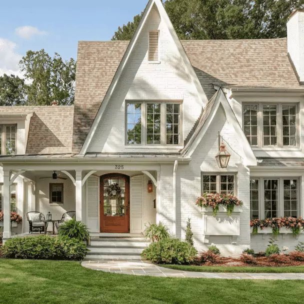
Agreeable Gray can work on the outside of a house too. On a home’s siding or trim it looks like a light warm gray. One color expert writes that Agreeable Gray “can be amazeballs on exteriors,” especially with stone or brick accents. In bright daylight it often reads almost like a soft white with warmth.
It goes well with white trim (many use Sherwin Pure White) and suits a wide range of exterior materials. The color may look a bit more muted or lighter outside, but that is usually good for making the house appear bright and clean.
One caution: if your stone or brick has very purple or pink tones, Agreeable Gray (which has only a whisper of violet) might not match perfectly – in that case a slightly different greige might be better.
Coordinate Colors of Agreeable Gray
Agreeable Gray is very versatile, so many colors go with it. Warm whites and beiges are a safe choice (like soft white, cream, or light tan). Pale greys or other greiges also pair nicely.
For cooler accents, muted greens and blues work well – for example, Sherwin-Williams Comfort Gray (a green-gray) or Rainwashed (a soft blue-green) look harmonious.
If you like a pop of color, Agreeable Gray can take bold accents: a deep navy (SW Naval) or a warm bronze (SW Urbane Bronze) will stand out against it.
Earth tones like warm taupe, muted clay, or chocolate brown are also nice with Agreeable Gray, adding richness without clashing. In short, think mostly soft neutrals and gentle color—Agreeable Gray will quietly complement them.
Soft Palette
For a soft, gentle look, stick with light neutrals and pastels. Agreeable Gray goes beautifully with cream, beige, or ivory accents. White trim or furniture (like SW Pure White or Alabaster) keeps the room airy.
Soft greens (like SW Comfort Gray or Phys Sea Salt) add a calm feel. Even pale blush or light yellow curtains can work because they let the gray show its warmth. Overall, using other gentle, muted colors (light blue-gray, soft pink, gentle greens) creates a serene scheme where nothing overpowers Agreeable Gray.
Bold Palette
If you want contrast, choose deeper, richer hues. A navy blue or forest green gives a strong contrast that makes Agreeable Gray look even warmer by comparison.
Warm reds or oranges (like SW Heartfelt red or even a muted terracotta) also pop beautifully against it. Dark accent pieces (charcoal, black, deep brown) add drama – for example, black metal chairs or a dark gray rug. Metallics like brass or gold accessories give a bold, elegant touch.
In short, pick one or two vibrant or dark colors (navy, emerald, brick red, dark gray) and use them sparingly (pillows, a wall, art) to create a lively palette with Agreeable Gray as the calm background.
Muted Palette
For a quiet, earthy look, use colors that are gentle or dusty. Soft greens, blues, and browns that have gray in them will make the room feel natural and relaxed.
For example, SW Comfort Gray (a soft muted green), SW Rainwashed (soft blue-green), or Behr Toasty Gray (a warm greige) blend softly.
Light grays like SW Edgecomb Gray or SW Dovetail can layer well with Agreeable Gray for a tone-on-tone effect. Muted mauve or lavender (like SW Misty) can also coordinate for a subtle touch. The idea is to keep all the colors on the quieter side – nothing too bright – so the room feels cozy and low-key.
FAQ
Agreeable Gray vs Repose Gray
Both are warm grays, but Agreeable Gray (SW 7029) is slightly lighter (LRV 60 vs 58) and a touch warmer. Repose Gray tends to have a bit more coolness or “grayness,” while Agreeable Gray leans a bit toward beige.
In practice, Agreeable Gray is often preferred for its warmer, friendlier feel. (Designers say Agreeable Gray is more popular these days because it’s more predictably warm than Repose Gray.)
Sherwin Williams Repose Gray vs Agreeable Gray: Which Gray is Right for You?
Agreeable Gray vs Revere Pewter
Revere Pewter (Benjamin Moore) is another warm greige. Revere Pewter is a bit darker (LRV 55) and can sometimes look more greenish. Agreeable Gray is slightly lighter and very slightly cooler.
This makes Agreeable Gray better for average or lower-light rooms since it reflects more light. In other words, Agreeable Gray is more neutral/warm-gray and Revere Pewter has a stronger green-beige cast.
Agreeable Gray vs Edgecomb Gray
Edgecomb Gray (Benjamin Moore) is lighter, cleaner, and a bit warmer than Agreeable Gray. Both are “greige” (gray-beige), but Edgecomb is softer. A rule of thumb: if you test Edgecomb Gray in a room and it looks good, Agreeable Gray will probably look good as well.
The two are very close. If you have a very dark or north-facing room, Edgecomb might be the better choice since it’s lighter and warmer.
Agreeable Gray vs Accessible Beige
Accessible Beige (SW 7036) is another warm neutral with greenish undertones. Accessible Beige is generally warmer and more beige, while Agreeable Gray is slightly cooler and more gray.
Both have green in them, but Accessible Beige feels more yellow-beige. A design expert notes that you should pick Accessible Beige for rooms with north-facing (cool) light because it will warm them up, and if Accessible Beige looks good in your space then Agreeable Gray likely will too.
Does Agreeable Gray look more gray or beige?
Agreeable Gray is definitely more gray than straight beige. Experts call it a “greige-taupe hybrid” – a warm gray. It mostly looks gray, but with a soft warm cast. In bright light it might tip a bit toward beige, but overall it is much more grayish. One review says “it favors gray over beige” and “sure as heck isn’t beige.”
What color should I paint my cabinets if my walls are Agreeable Gray?
Many people use white or cream cabinets with Agreeable Gray walls – white (e.g. SW Alabaster) always looks crisp. If you want color cabinets, navy or charcoal (like SW Naval or SW Iron Ore) can be beautiful accents.
Another popular idea is two-tone: paint lower cabinets Agreeable Gray and upper cabinets a soft white. Designers also say that painting cabinets Agreeable Gray itself is very stylish – it gives a timeless, warm look. In short, white/cream are classic choices, but deep blues, grays, or even wood stains also match well with Agreeable Gray walls.
What color curtains with Agreeable Gray walls?
Curtains in soft neutral or warm tones usually work best. For example, light tan or cream curtains will look clean and gentle. In one home, peach-colored curtains were used and they made the Agreeable Gray walls look even warmer and cozier.
In general, pale colors (like soft pink, beige, or even light blue) will complement the gray-beige walls. Or you could match the trim with crisp white curtains for a bright look. The key is to pick something that doesn’t clash – warm neutrals or gentle pastels are safe bets.
What rooms are best for Agreeable Gray?
It’s a very flexible color that can work in almost any room. Designers use it on living room walls, bedrooms, kitchens, bathrooms, even hallways. It creates a nice flow in open-plan homes too. Because it’s neutral and not too dark, it tends to look good from room to room. Specifically, Agreeable Gray is often chosen for living rooms (warm backdrop), bedrooms (calming color), kitchens (goes with many cabinets), and bathrooms (warm but fresh).
What color trim goes best with Agreeable Gray walls?
A clean white trim is a classic pairing. Sherwin-Williams Pure White or Alabaster are very common choices with Agreeable Gray. The white trim brightens the room and makes the walls stand out.
Other off-white or very light gray trims also work. Basically, using a crisp light color for trim (white, ivory, soft cream) always looks good with Agreeable Gray because it highlights the warm gray walls.
Is Agreeable Gray too dark?
Not really. With its LRV of 60, it’s a light-to-medium gray. It is not as bright as pure white, but it still keeps rooms feeling open if there’s enough light. It’s darker than an off-white but lighter than many modern grays.
In a very small or windowless room it might seem a bit dull, but in most living spaces and halls it looks just right – light gray that’s definitely not too dark.
One blog calls 60 “the sweet spot” for a neutral – bright enough, but with substance. So generally it’s not too dark for normal rooms and actually helps walls look warm and grounded.
Behr equivalent
If you use Behr paints instead of Sherwin-Williams, the closest match to Agreeable Gray is Toasty Gray (from Behr’s palette). Toasty Gray is also a warm greige with similar greenish undertones, though it may be a bit warmer.
In short, look for Toasty Gray in Behr if you want something like Sherwin’s Agreeable Gray.


